Edward Kucherenko.
All rights reserved © 2026


contact
phone: +380632304280
email: edwardkucherenko@gmail.com
where do you want to go next?
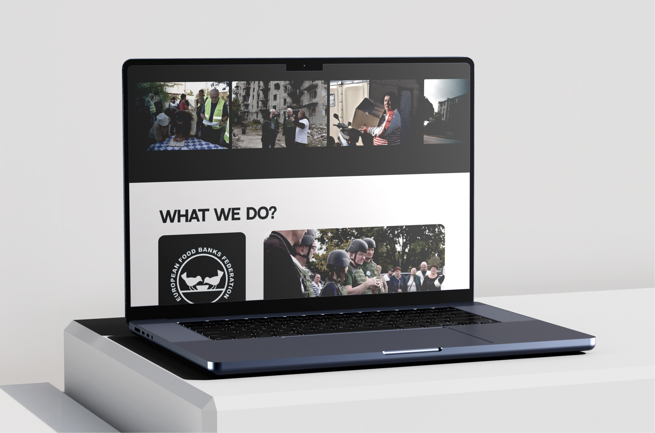
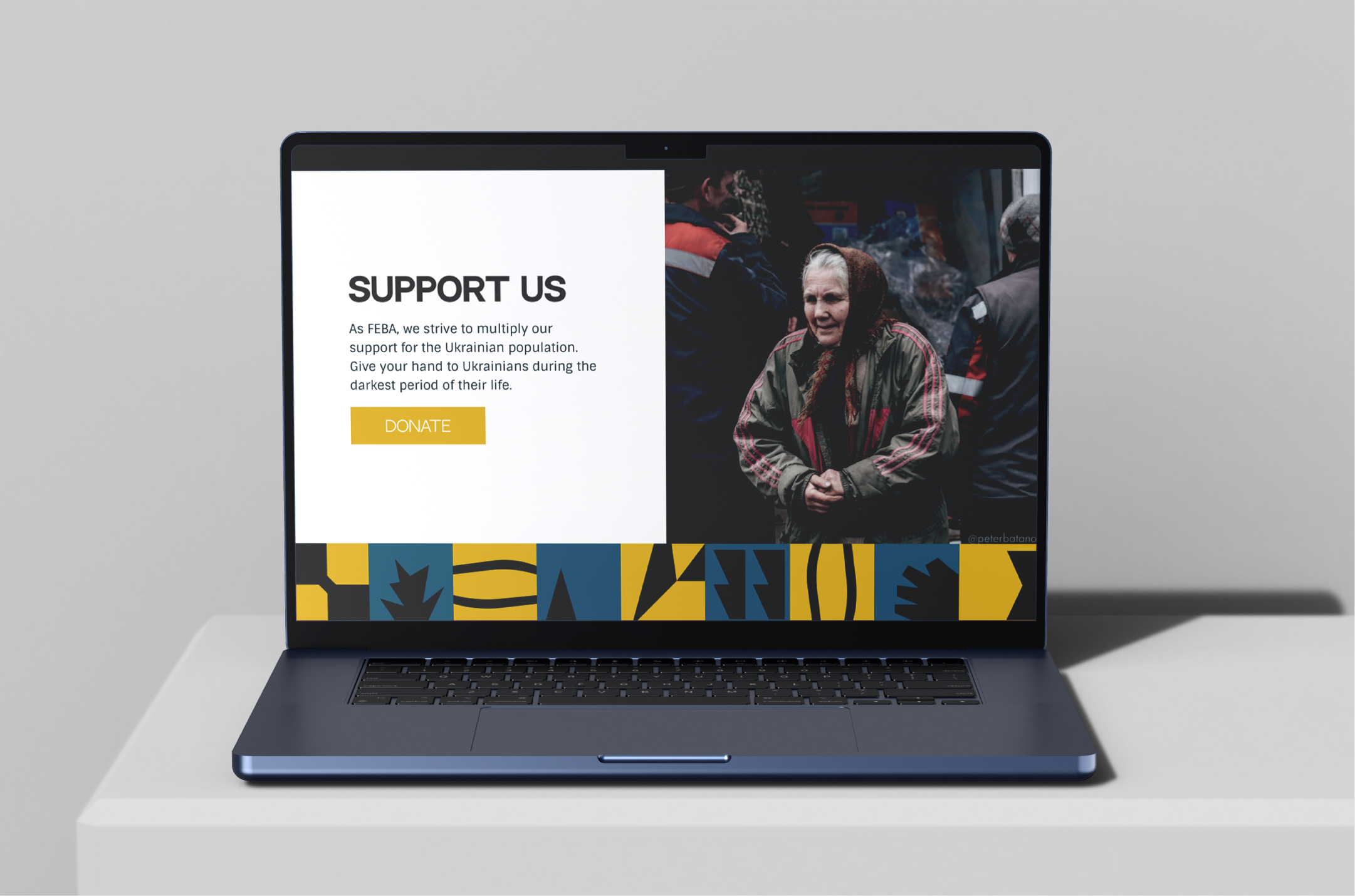
Campaign Landing Page
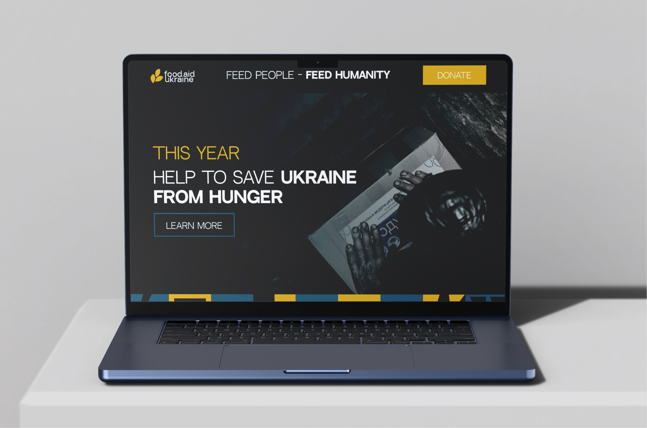
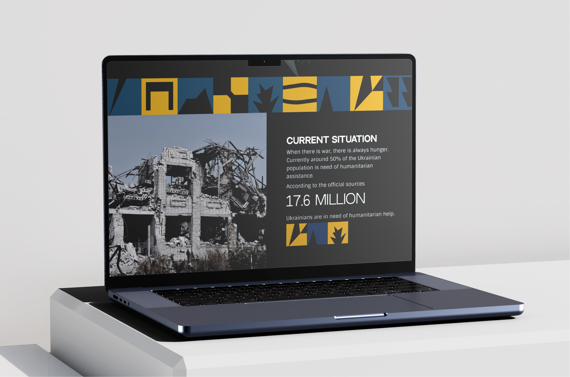
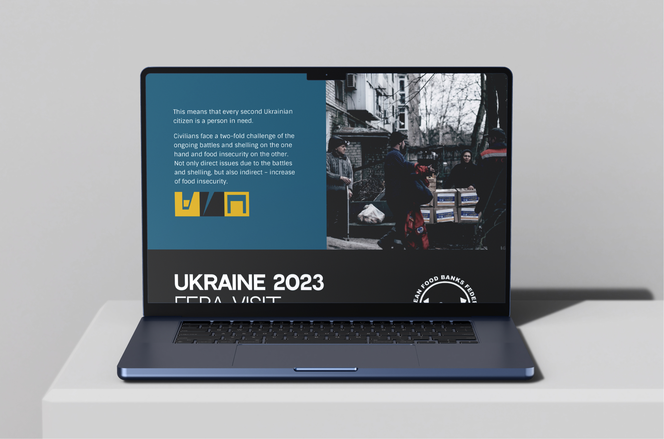
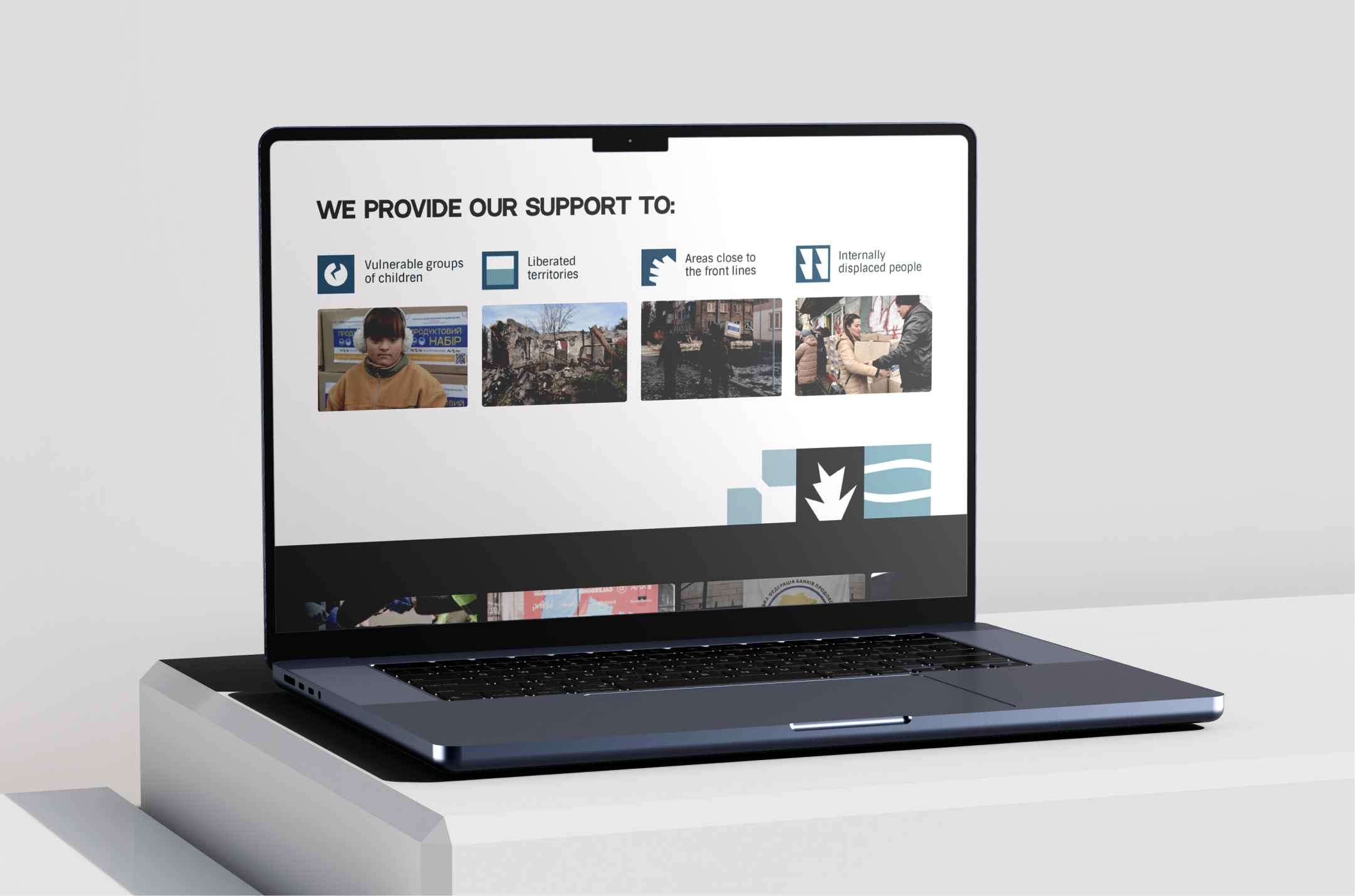
The visual system was extended into a dedicated fundraising landing page, translating the brand into a more focused digital experience. Photography, typography, data and graphic elements were combined to communicate the urgency of food insecurity in Ukraine, explain the organisation’s work and guide visitors towards supporting the initiative.
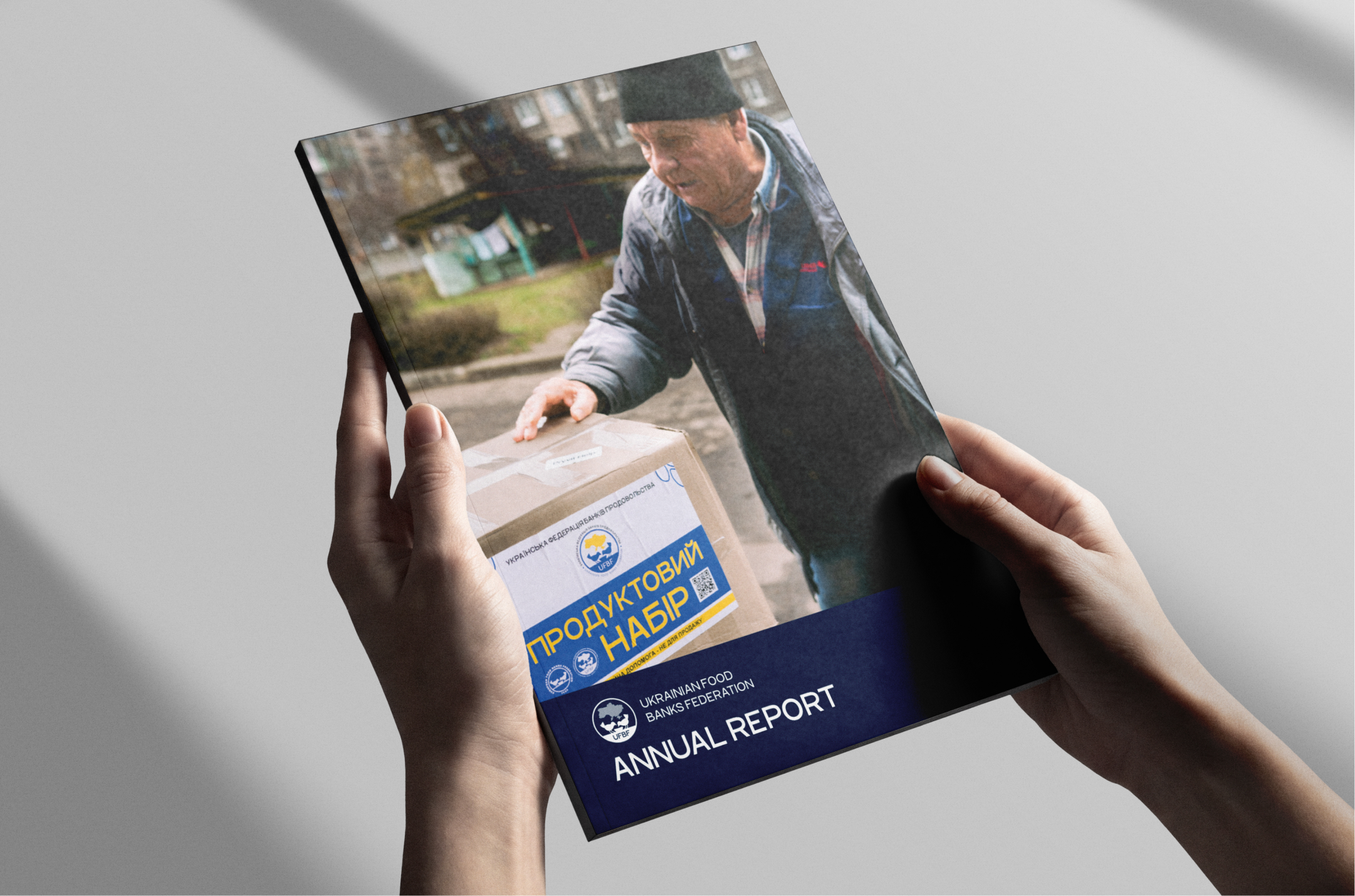
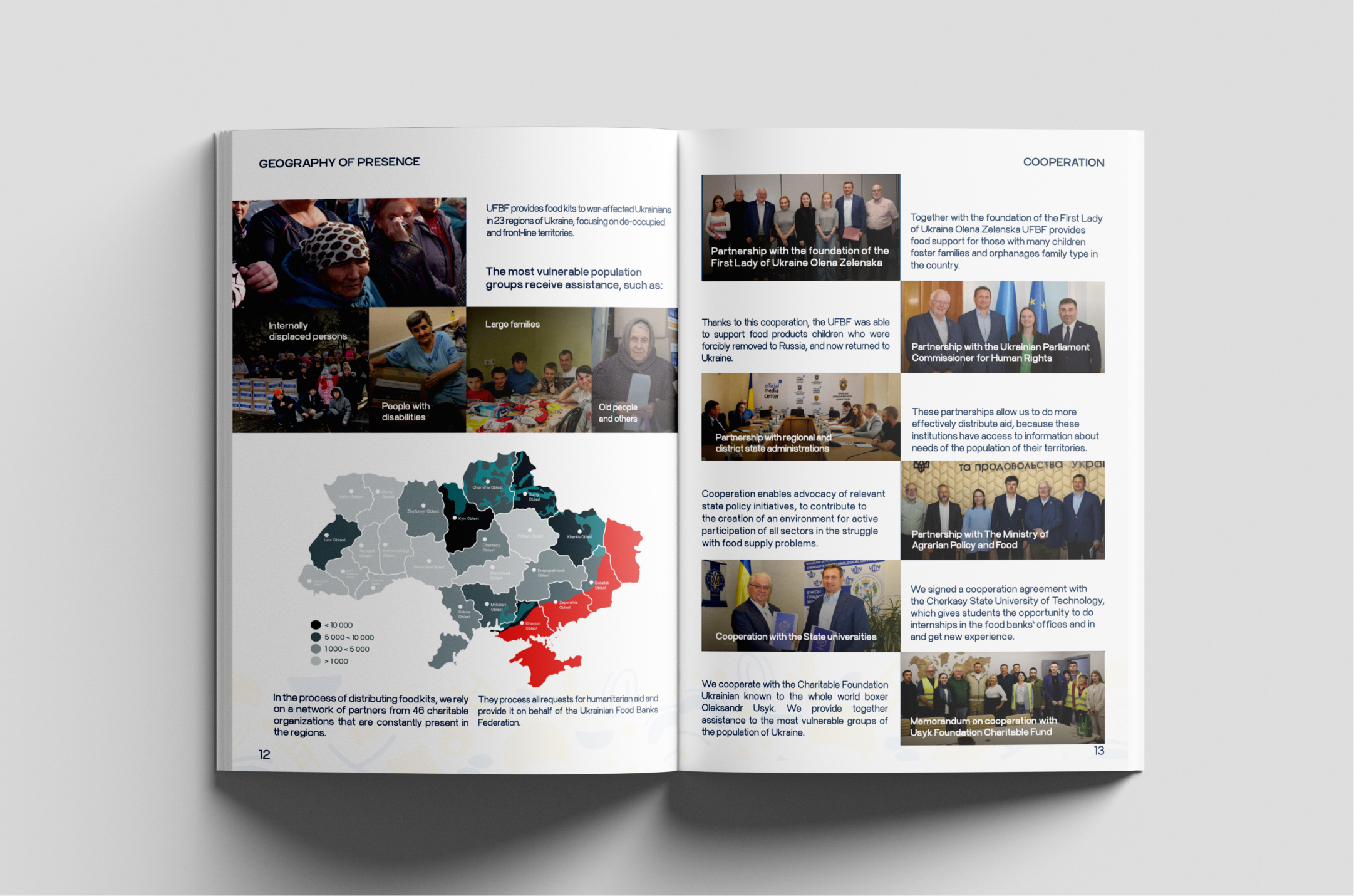
Reports & Information Design
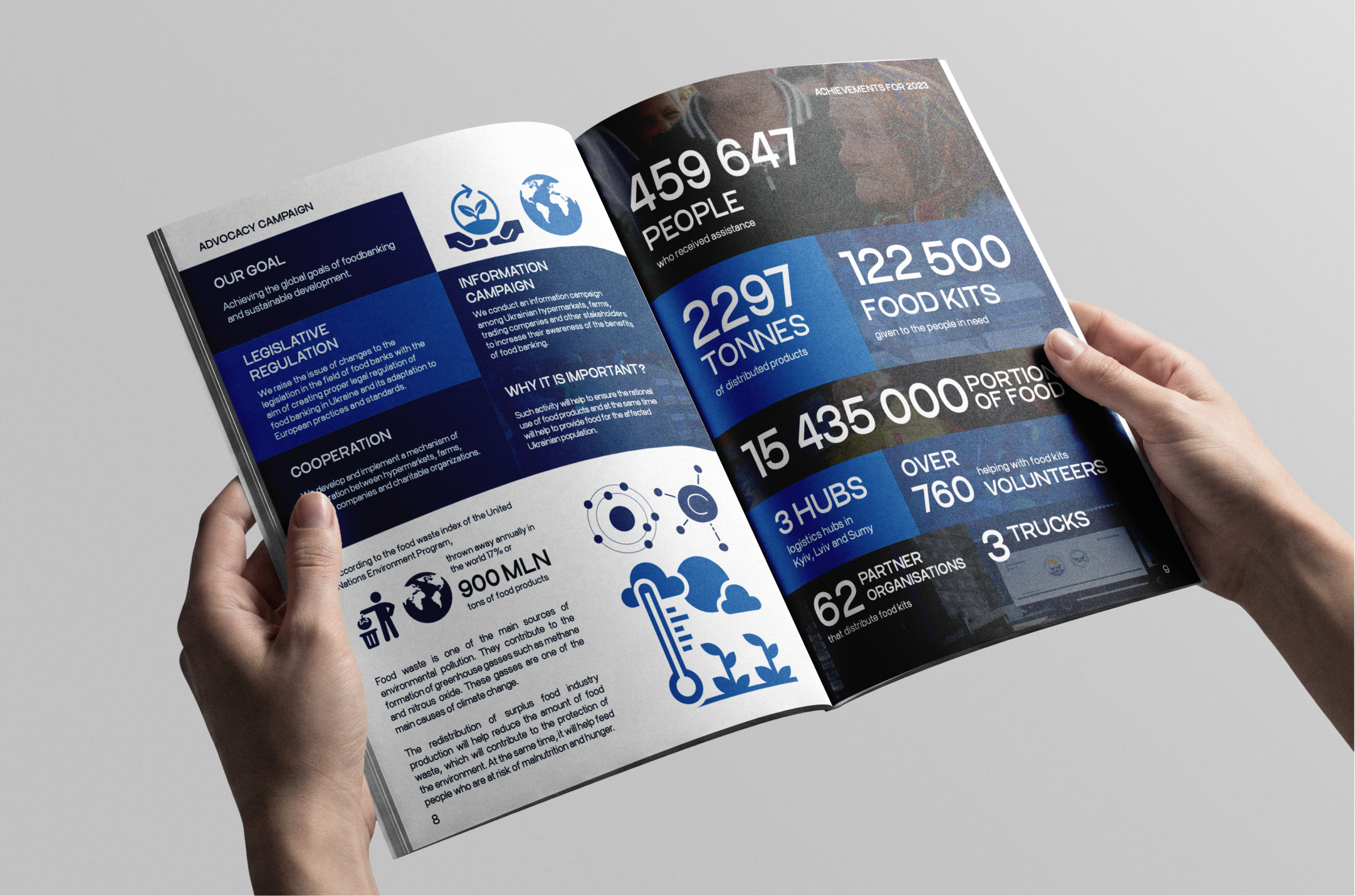
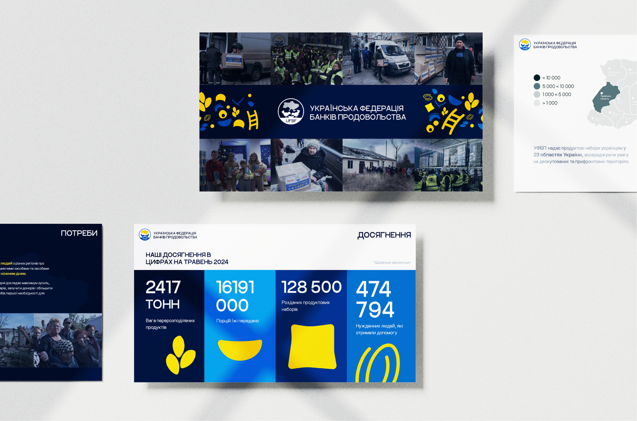
The same visual language was extended to annual reports and presentation materials, where the challenge shifted from brand recognition to information clarity. Photography, maps, statistics, infographics, and partnership stories were organized into structured layouts that could communicate the Federation’s activity and impact to partners and stakeholders.
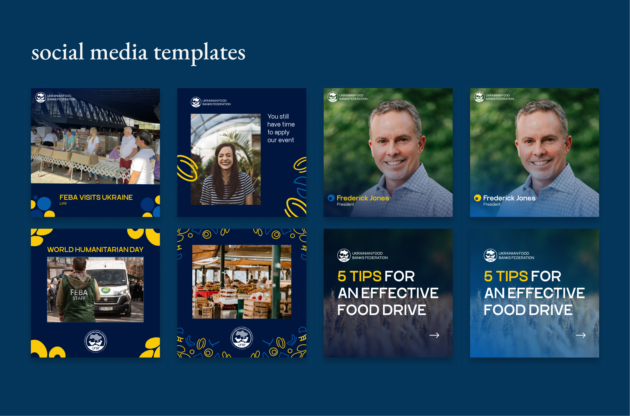
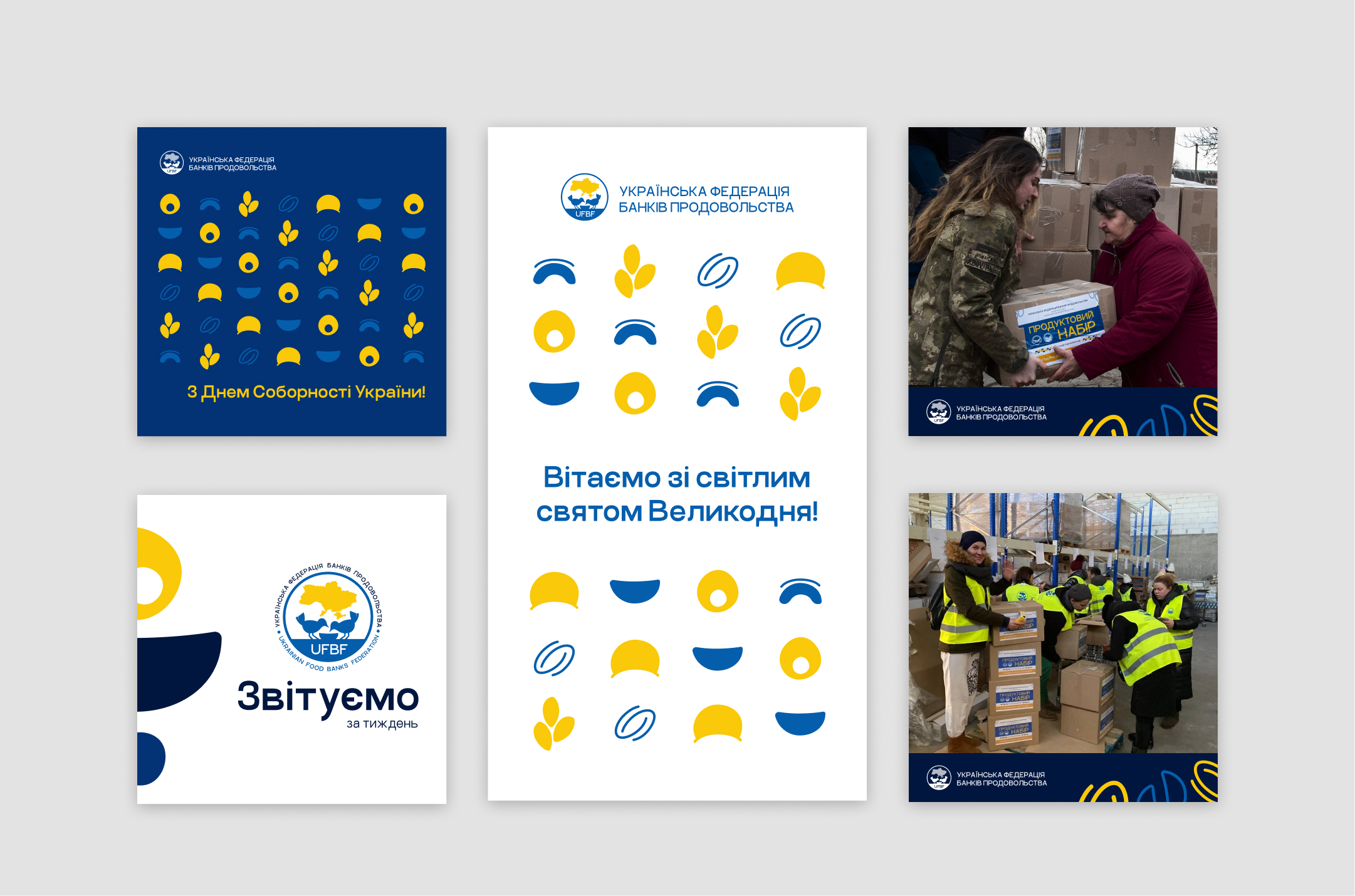
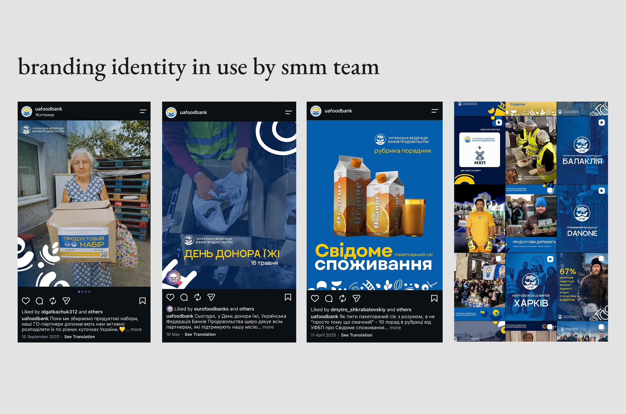
Social media became one of the most active applications of the identity. A flexible set of layouts allowed the team to combine photography, announcements, educational content, humanitarian updates, and campaign messages while maintaining a recognizable visual presence across different types of posts.
Social Media & Communication
step #4
Designing for Everyday Use
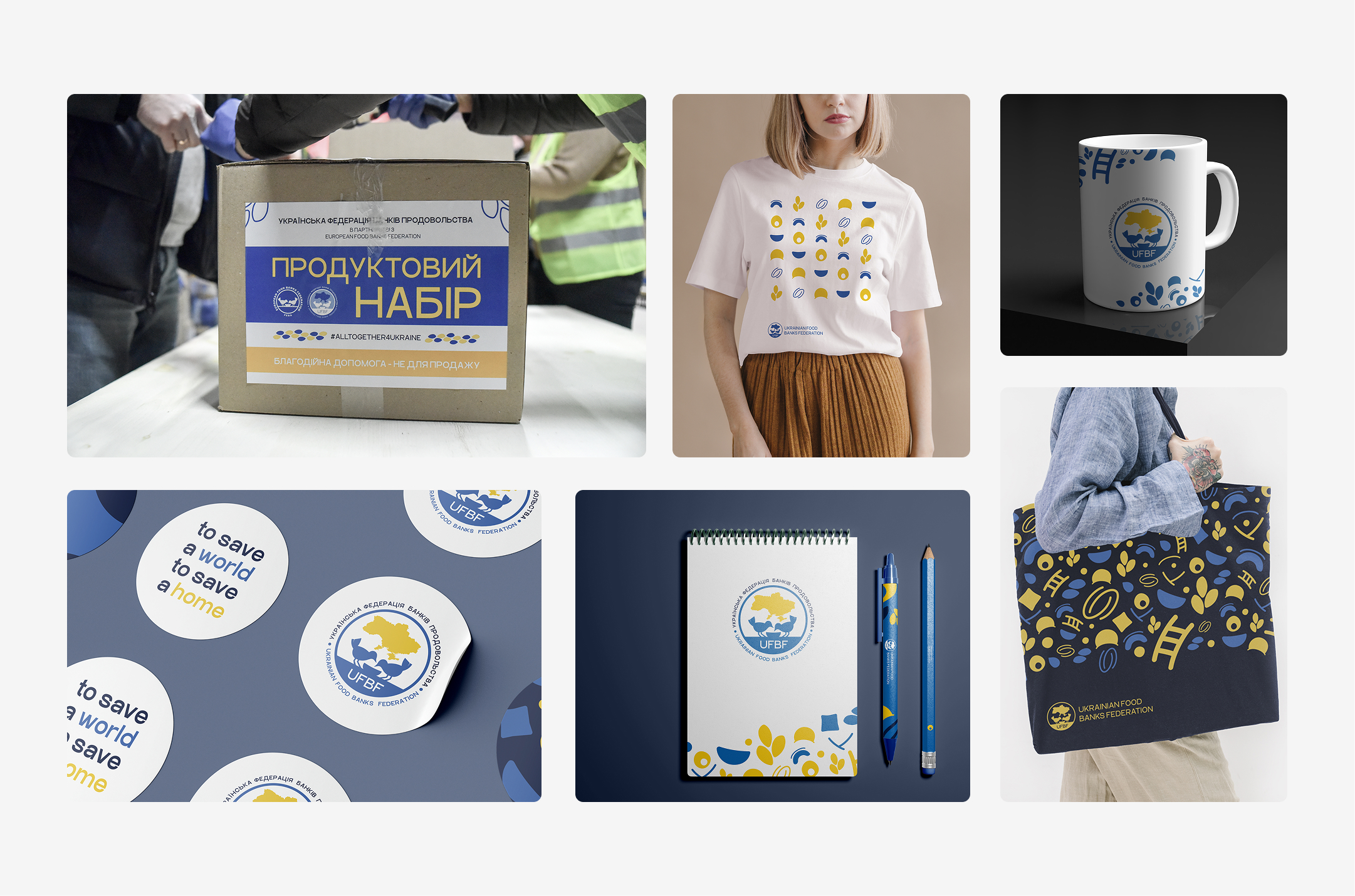
Once the core identity was established, it had to support the Federation’s everyday communication - from social media and humanitarian updates to reports, presentations, campaigns, and printed materials. I adapted the visual system to different types of content, balancing consistency with enough flexibility to communicate stories, activities, partnerships, and data without making every format look the same.
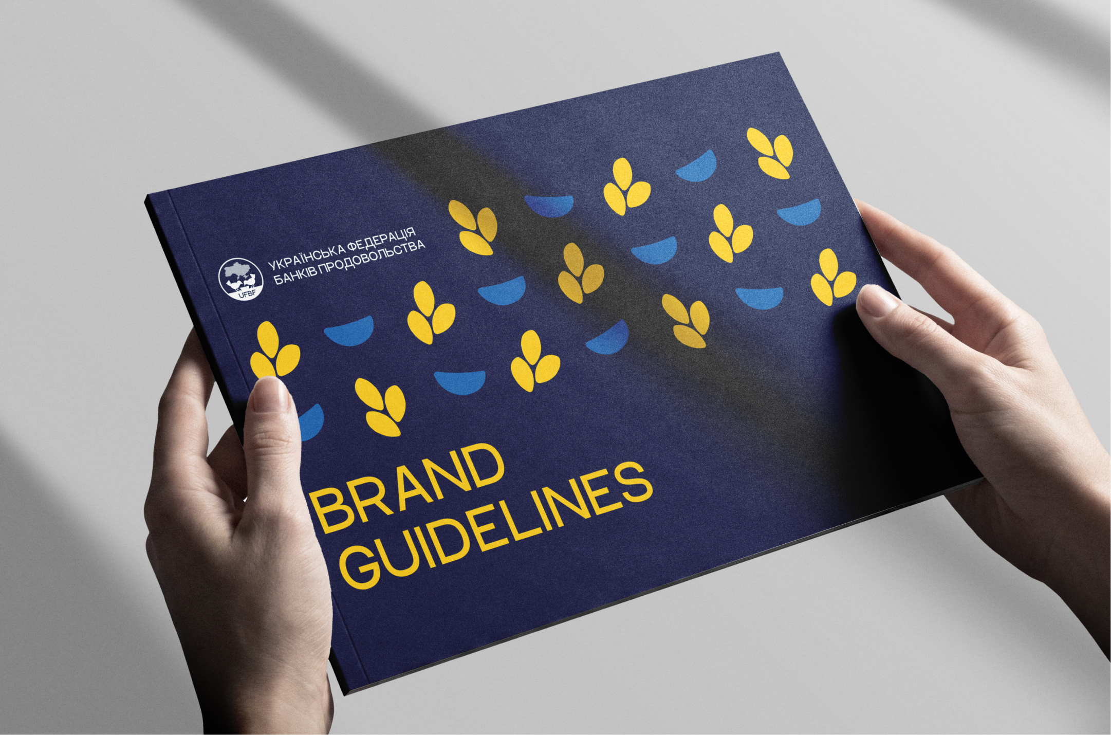
To make the identity consistent and easy to use across the organization, I translated the visual system into a practical set of brand guidelines covering logo usage, colors, typography, and core visual principles.
Building the Brand Toolkit
step #3
Building the Symbol Library
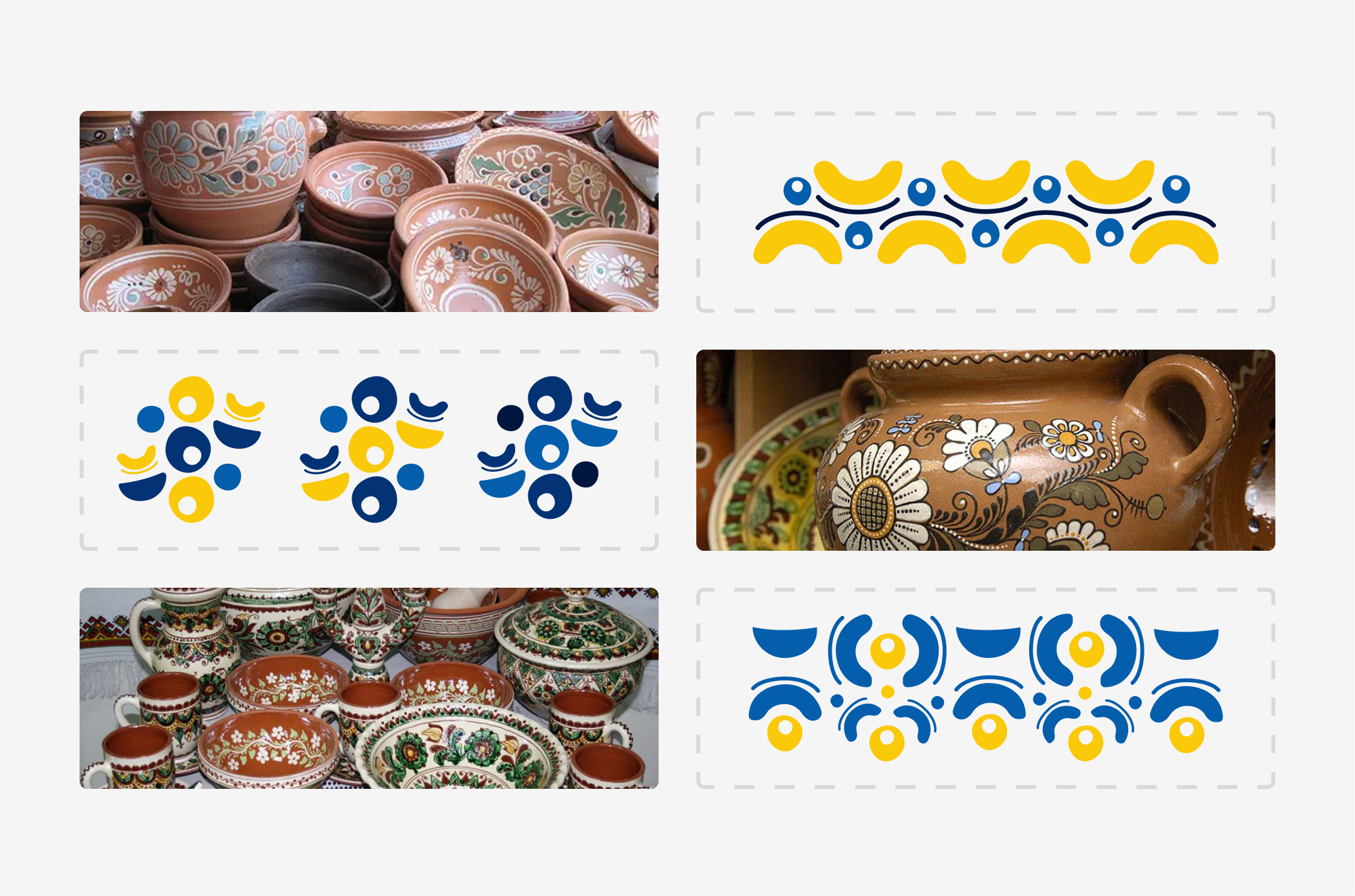
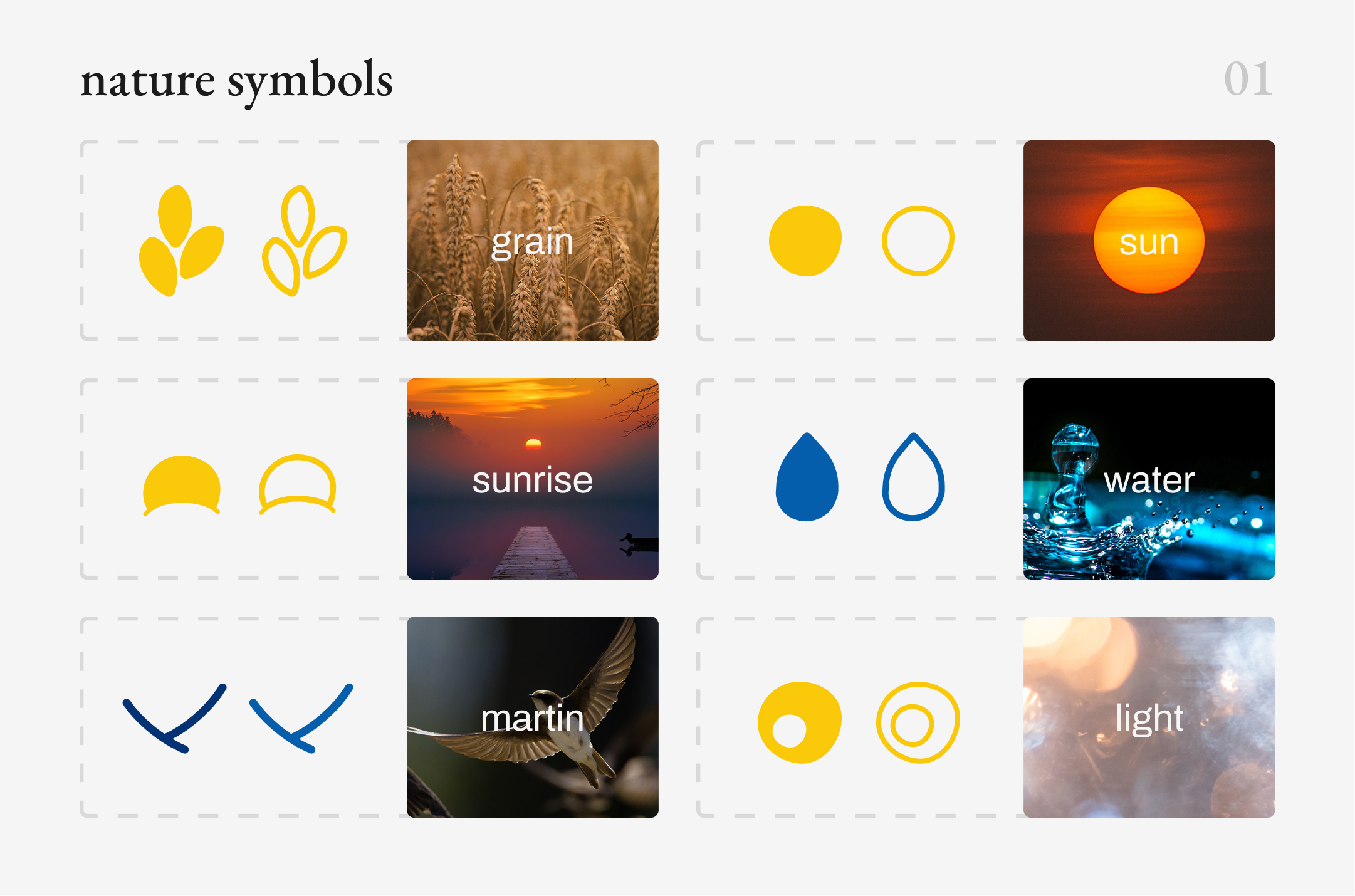
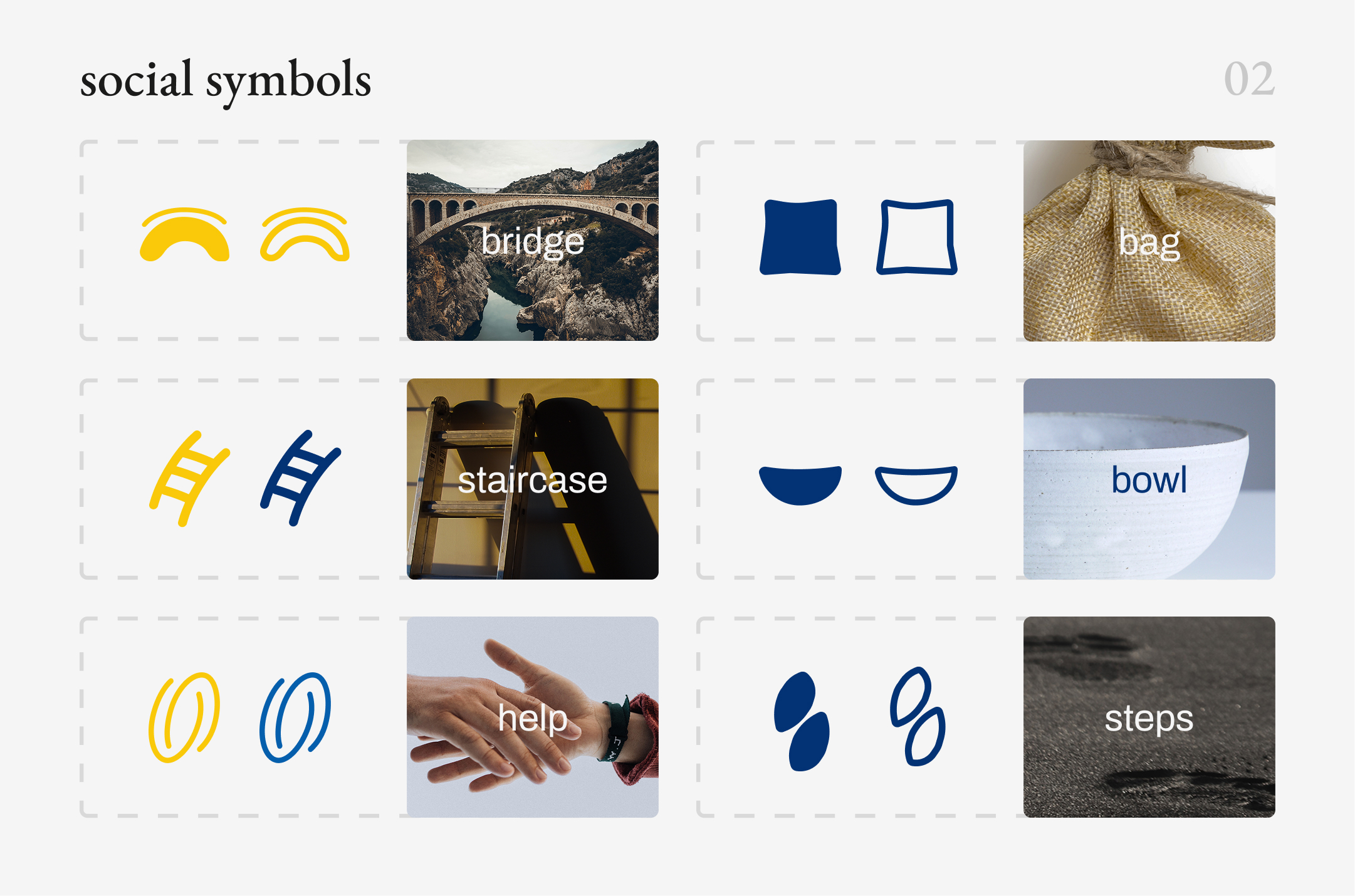
The visual language was built from a library of simple graphic symbols inspired by nature, food, community and everyday life. Each element carries its own meaning, while filled and outlined variations allow the symbols to work individually, in small compositions or as building blocks for more complex patterns.



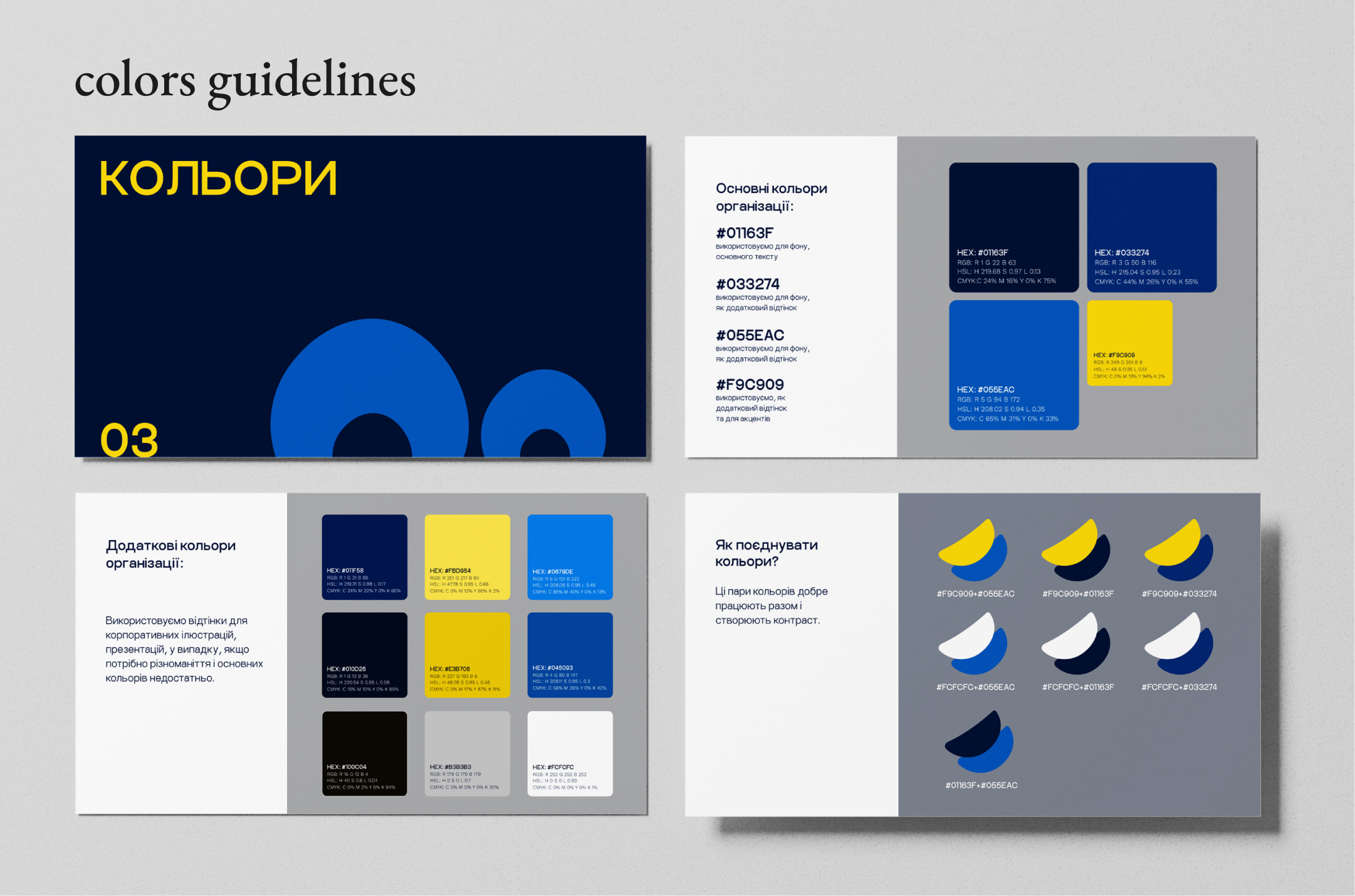
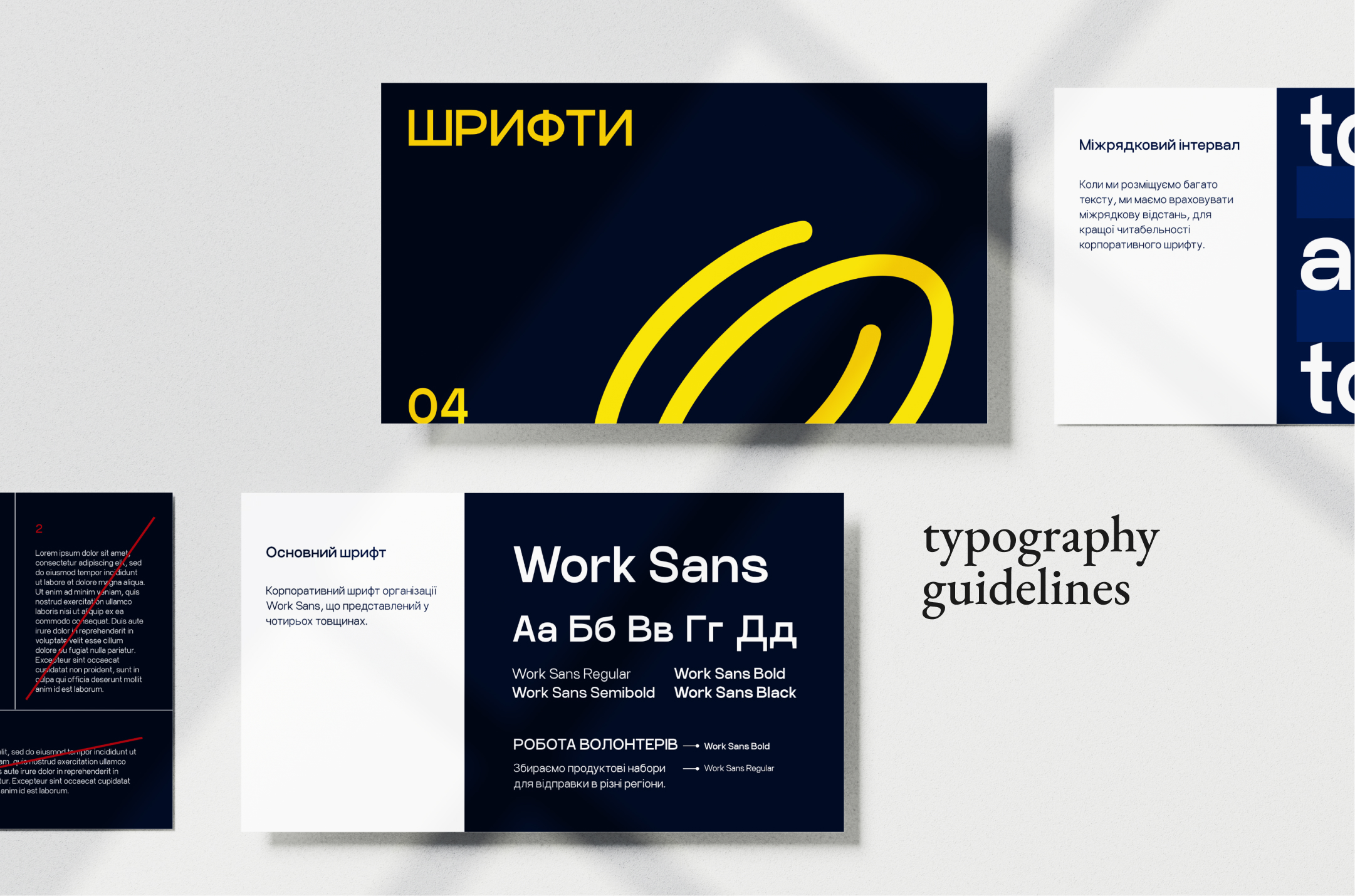
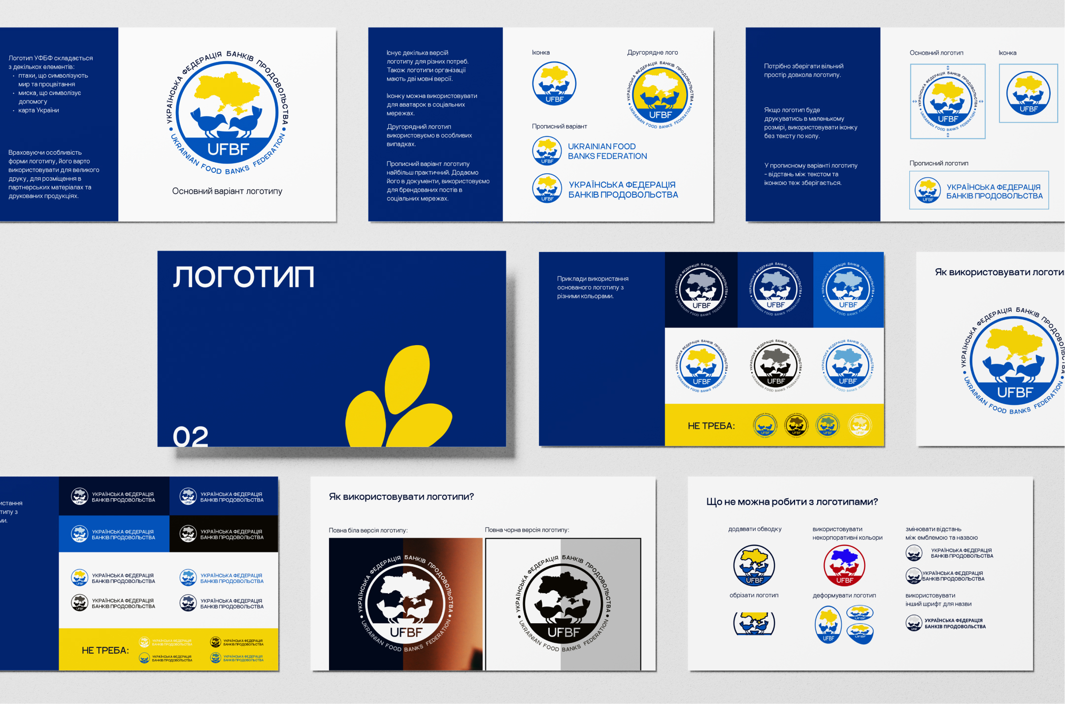
The toolkit was built around real communication needs rather than a fixed set of assets. Logo variations were prepared for different formats, languages, scales, and backgrounds, while the color and typography systems provided enough flexibility for both everyday materials and more complex communications.
Clear usage rules helped the team combine these elements consistently as the brand continued to evolve.
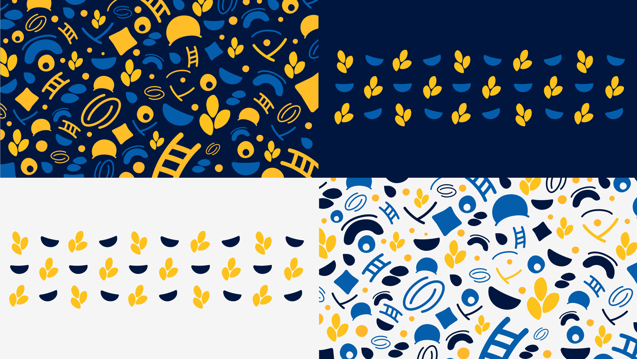
A Flexible Pattern System
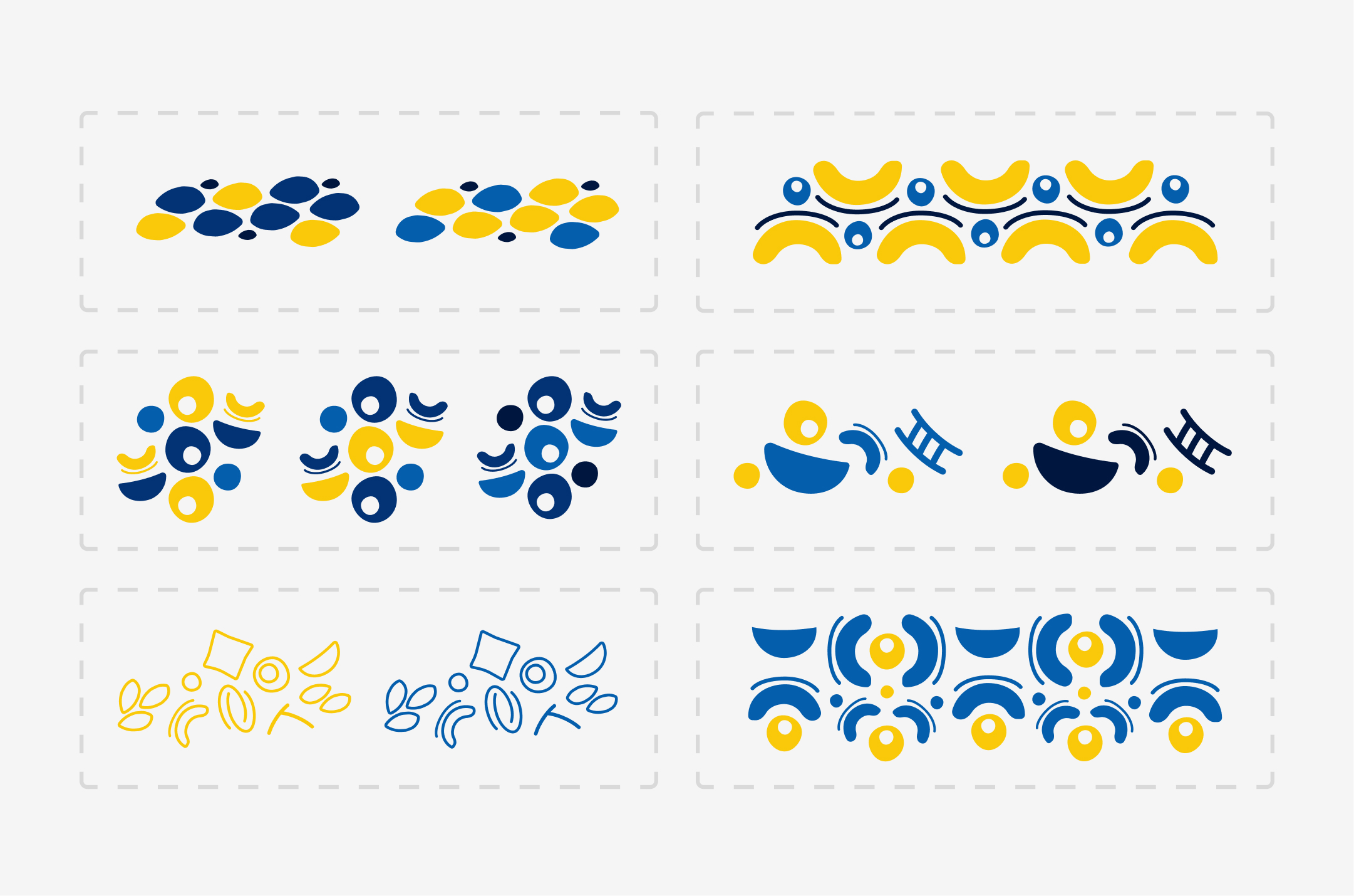
The resulting system can shift between structured ornaments and expressive all-over patterns while remaining recognizably UFBF. By recombining the same visual vocabulary, the identity can adapt to different formats without relying on a single fixed composition.
Inspired by Ukrainian decorative traditions, particularly painted ceramics and folk ornament, the symbols were combined into original compositions and repeating motifs. Rather than reproducing traditional patterns directly, the system translates their visual rhythm and modularity into a contemporary graphic language.
From Symbols to Ornament
step #2
Building a Ukrainian Visual Language
With the core identity established, the next step was to develop a distinctive visual language around it. Drawing from Ukrainian decorative traditions, the goal was to create a contemporary system that could carry a sense of cultural identity while remaining flexible enough for different formats and communication needs.
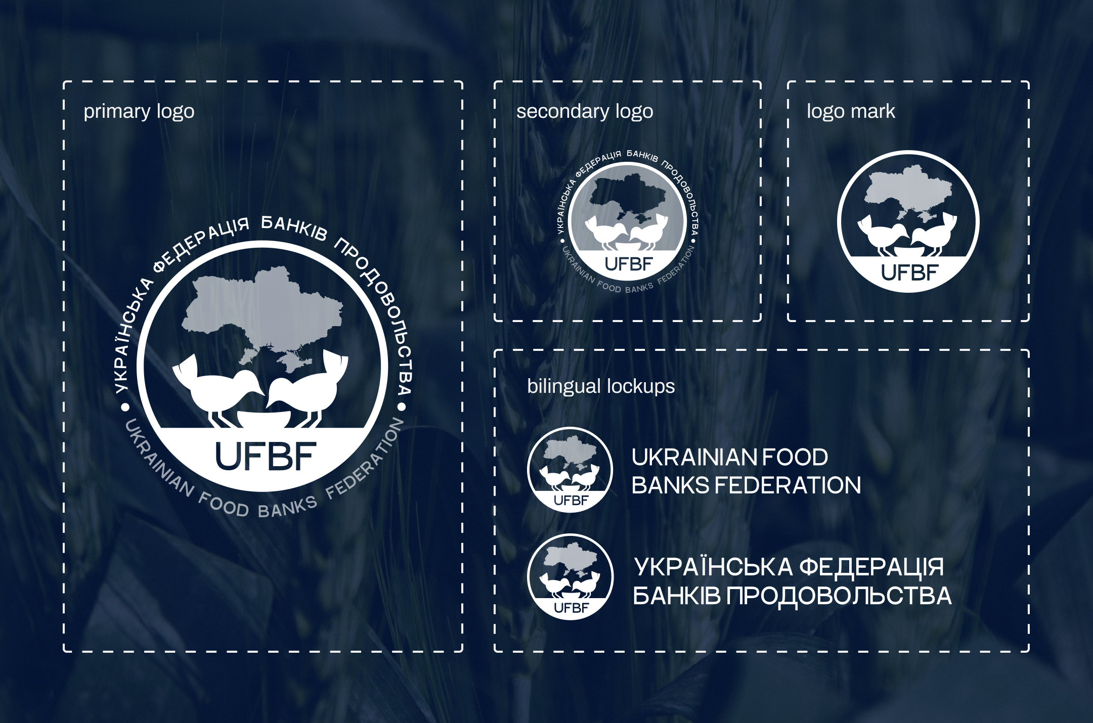
The refined mark became the foundation for a flexible logo system, with primary, secondary and compact versions designed for different scales and applications. Ukrainian and English lockups extended the system for both local and international communication.
Print & Digital Design
Design Enablement
Designer
smm team
Client / Stakeholder
team
role
Brand / Graphic Designer
Graphic System
social Media Templates
project overview
Flexible Visual Identity System
step #1
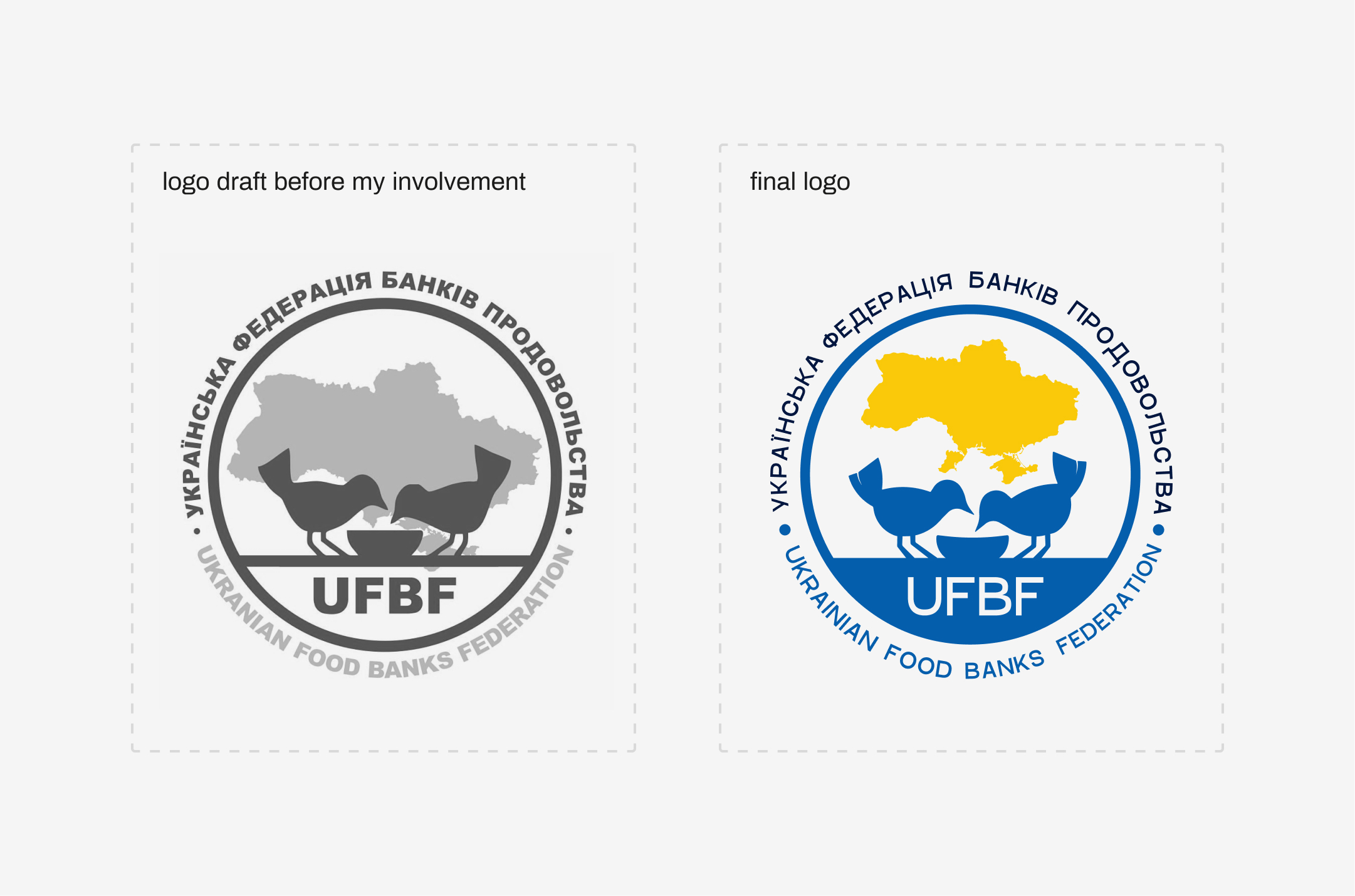
I explored different compositions, proportions and type treatments to find a version that could retain the original character while becoming clearer, more balanced and easier to reproduce across different formats.
From Draft to Identity
Brand Identity Design
Brand Guidelines
tools used
The project started with an existing logo draft. The first step was to preserve its core idea while transforming it into a consistent, flexible system that could support the Federation across different contexts and formats.
The Federation already had an initial logo concept that captured the core idea of the organization. Rather than replacing it, I refined the existing direction — improving its composition, typography and visual balance while preserving the original symbolism.
Visual Identity
Logo System
responsibilities
Nov 2022 - Nov 2023
project timeline
client
general info
Ukrainian Food Banks Federation
Ukrainian Food Banks Federation
Ukrainian Food Banks Federation (UFBF) approached me to develop its first comprehensive visual identity, building on an initial logo concept and establishing a consistent foundation for the organization’s communications.
The project grew from a logo and starter identity into a flexible brand system covering digital and print communications, social media, presentations, official documents, merchandise, and web experience.