email: edwardkucherenko@gmail.com
phone: +380632304280
contact


Edward Kucherenko.
All rights reserved © 2026
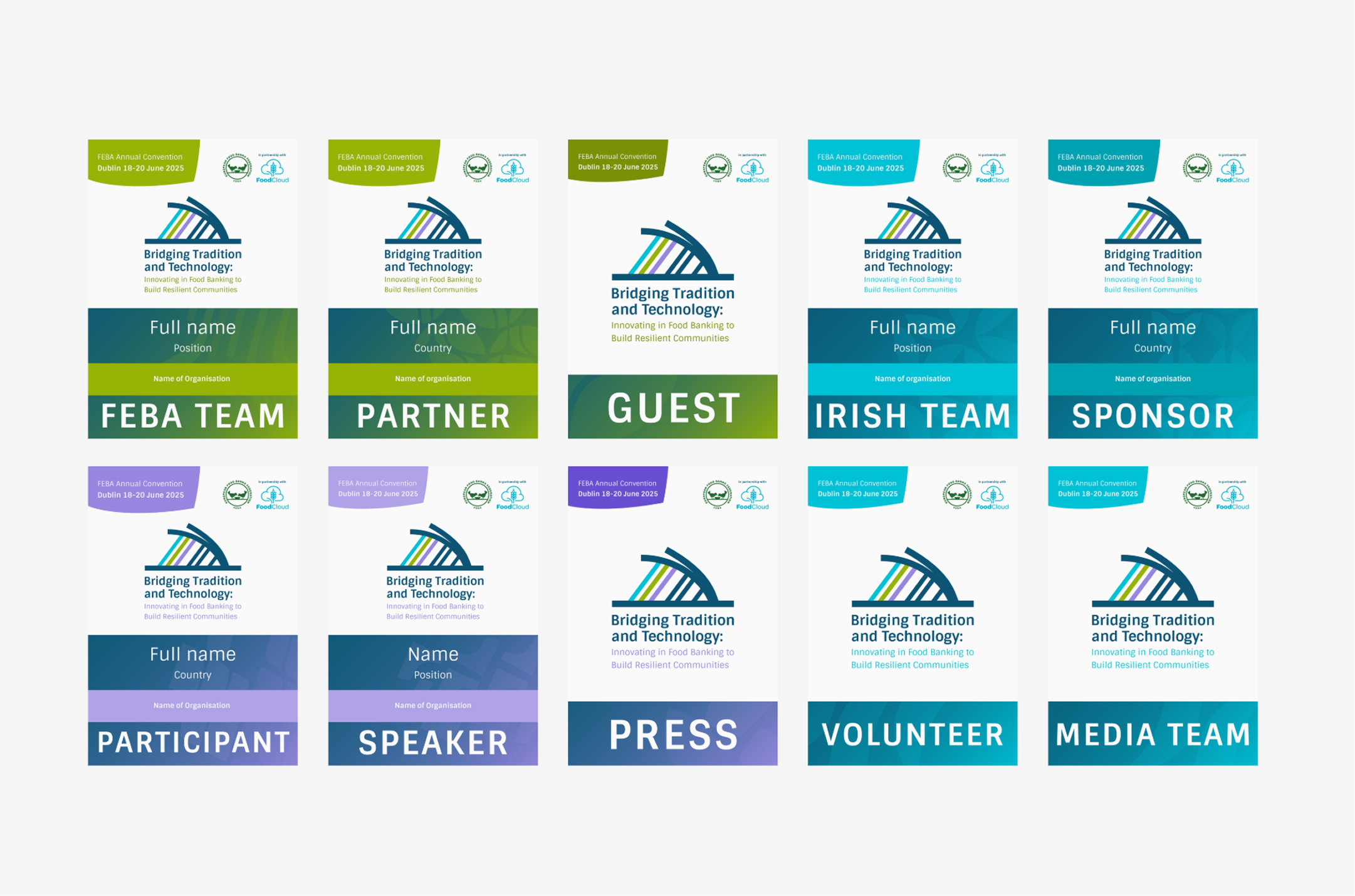
Purple — Community & Exchange
Participants, Speakers, and Press sit at the center of dialogue, knowledge sharing, and the wider Convention community.
Blue — Innovation & Development
Sponsors, Volunteers, Media, and the Irish Team represent the groups that enable, support, communicate, and move the event forward.
Partners, FEBA Team, and Guests represent the established network and the foundation the Convention is built upon.
Green — Tradition & Foundation
behind badges system
The three-color palette was extended into the badge system, using the same themes to group different roles within the Convention.
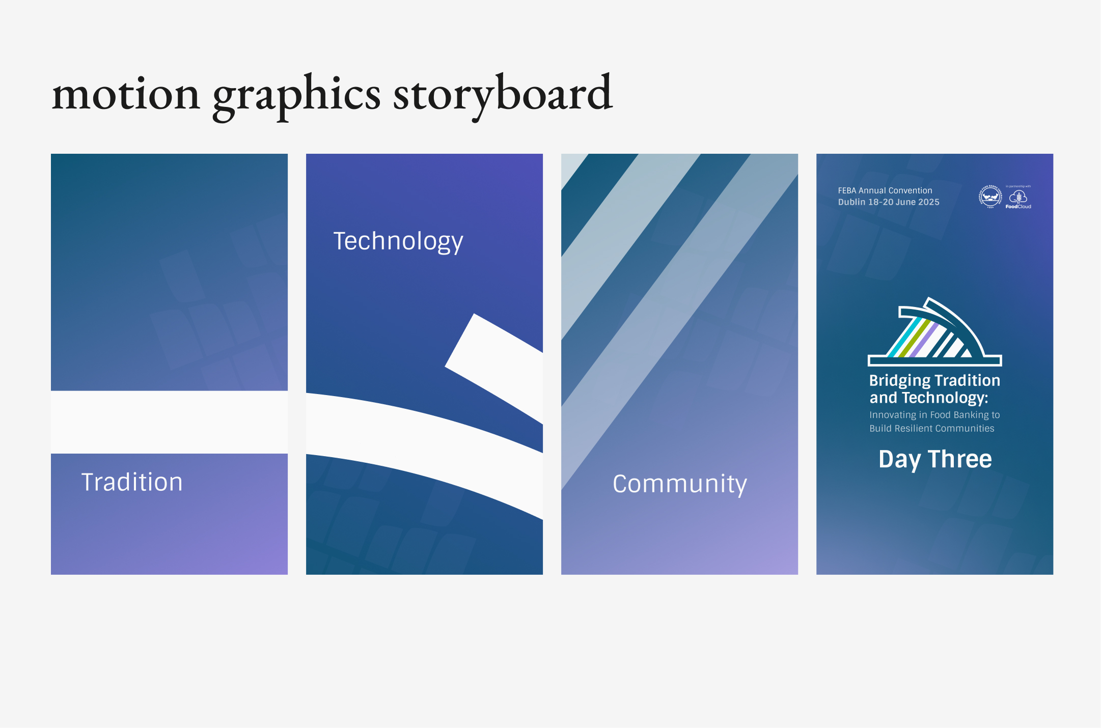
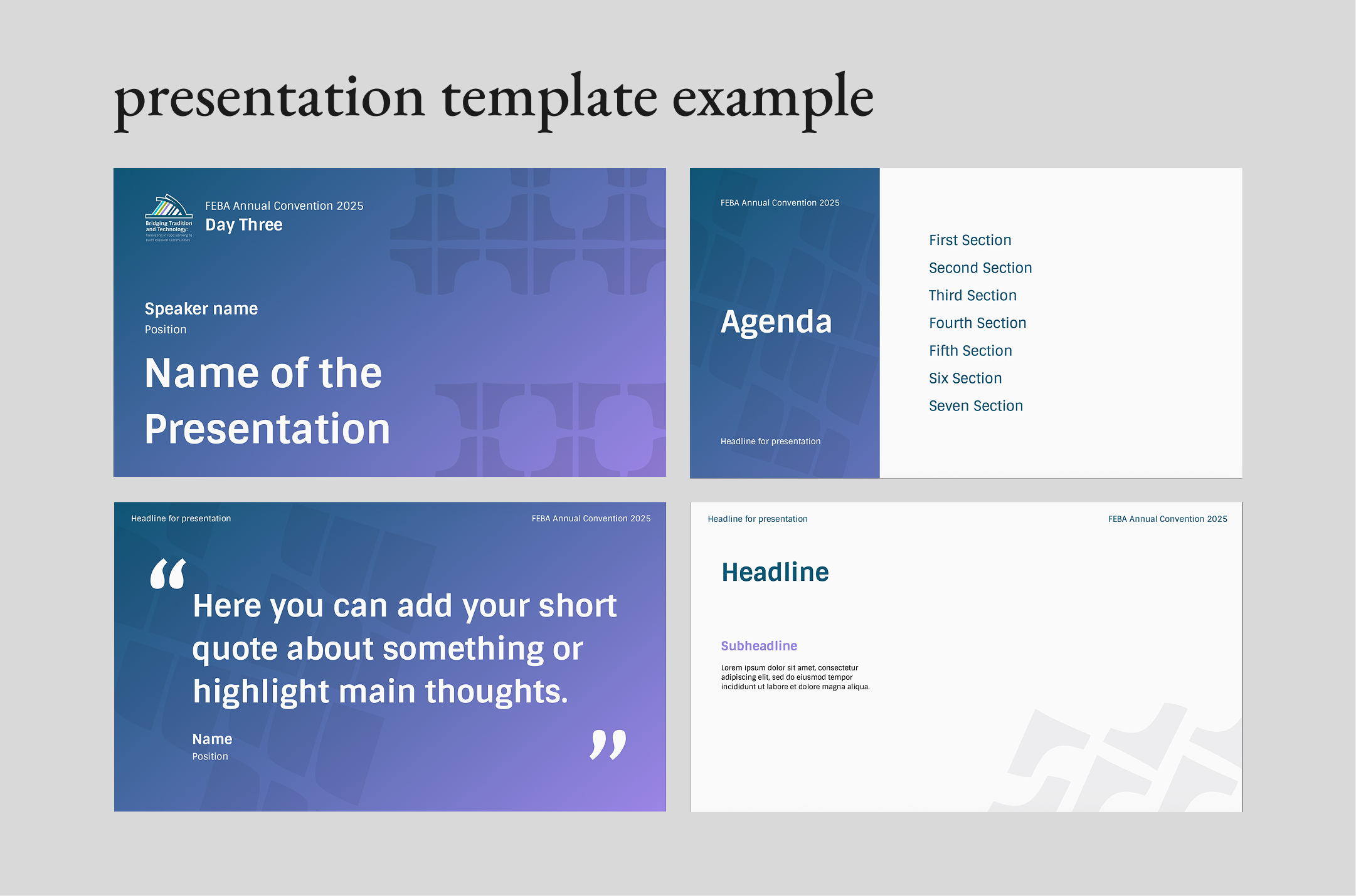
Purple marks the culmination of the three-day journey — bringing together shared knowledge, new perspectives, and stronger connections. It represents a resilient community shaped by learning, collaboration, and exchange.
day three - community & resilience
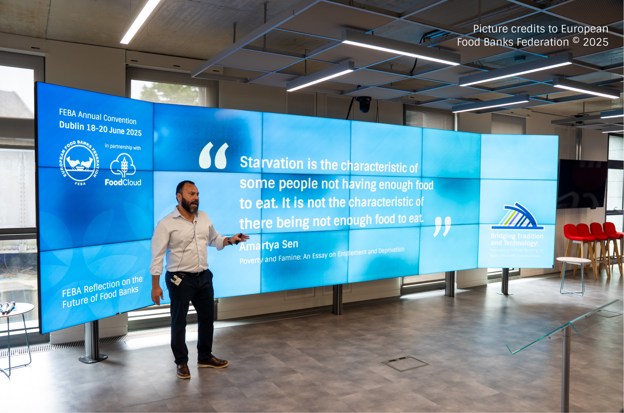
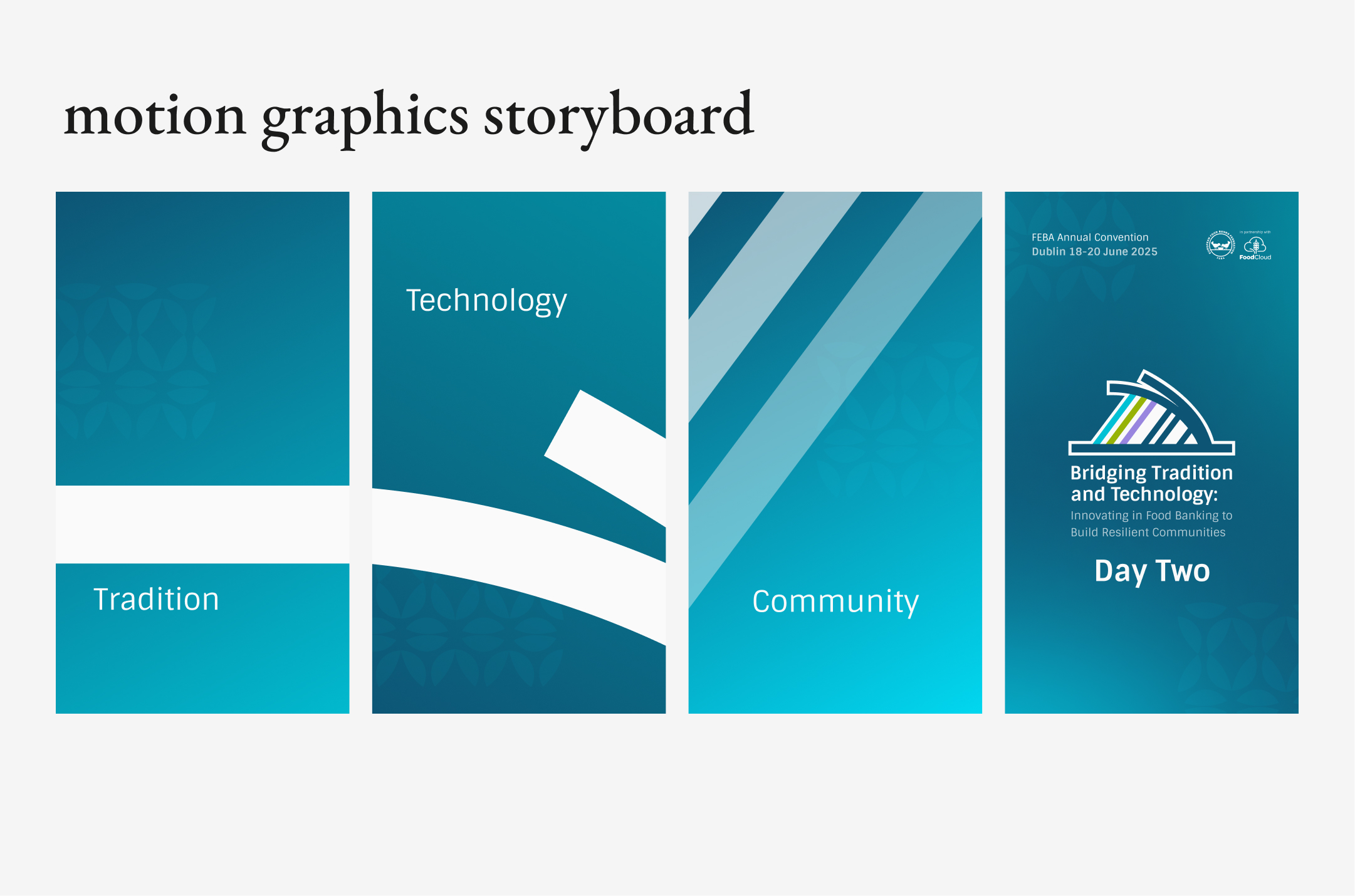
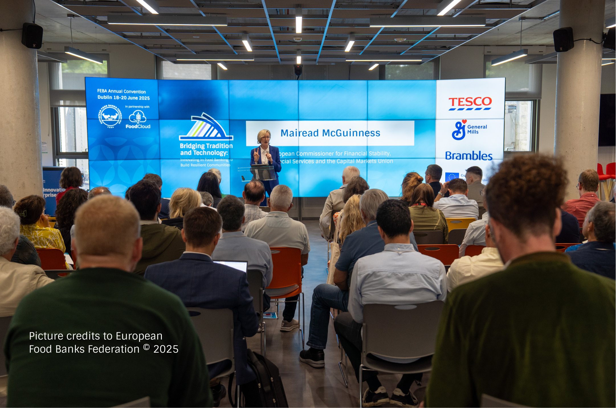
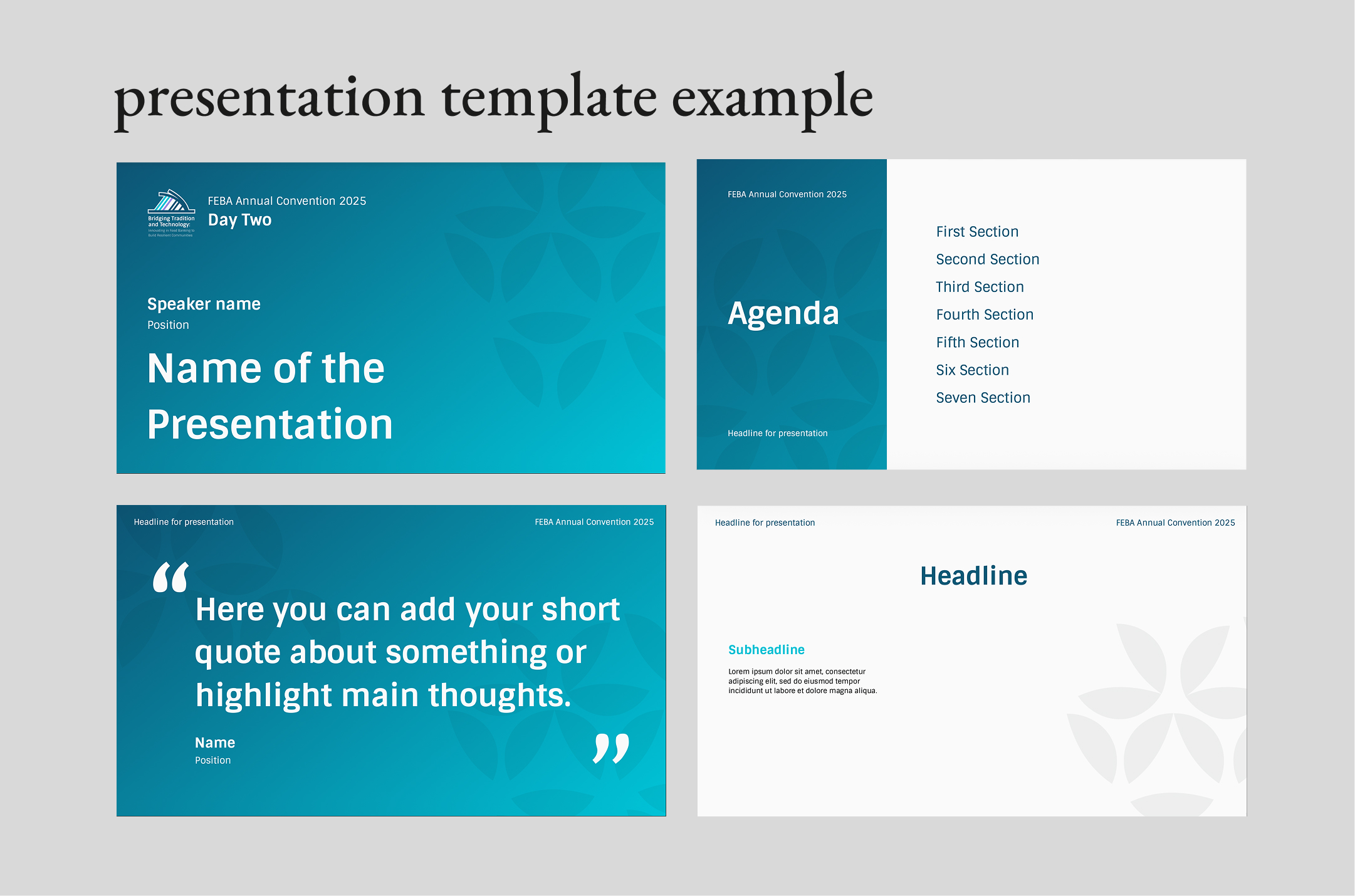
Blue and turquoise shift the visual language towards technology, innovation, and continuous change. Inspired by Ireland’s relationship with the sea, the palette introduces a sense of movement and transition.
day two - innovation & movement
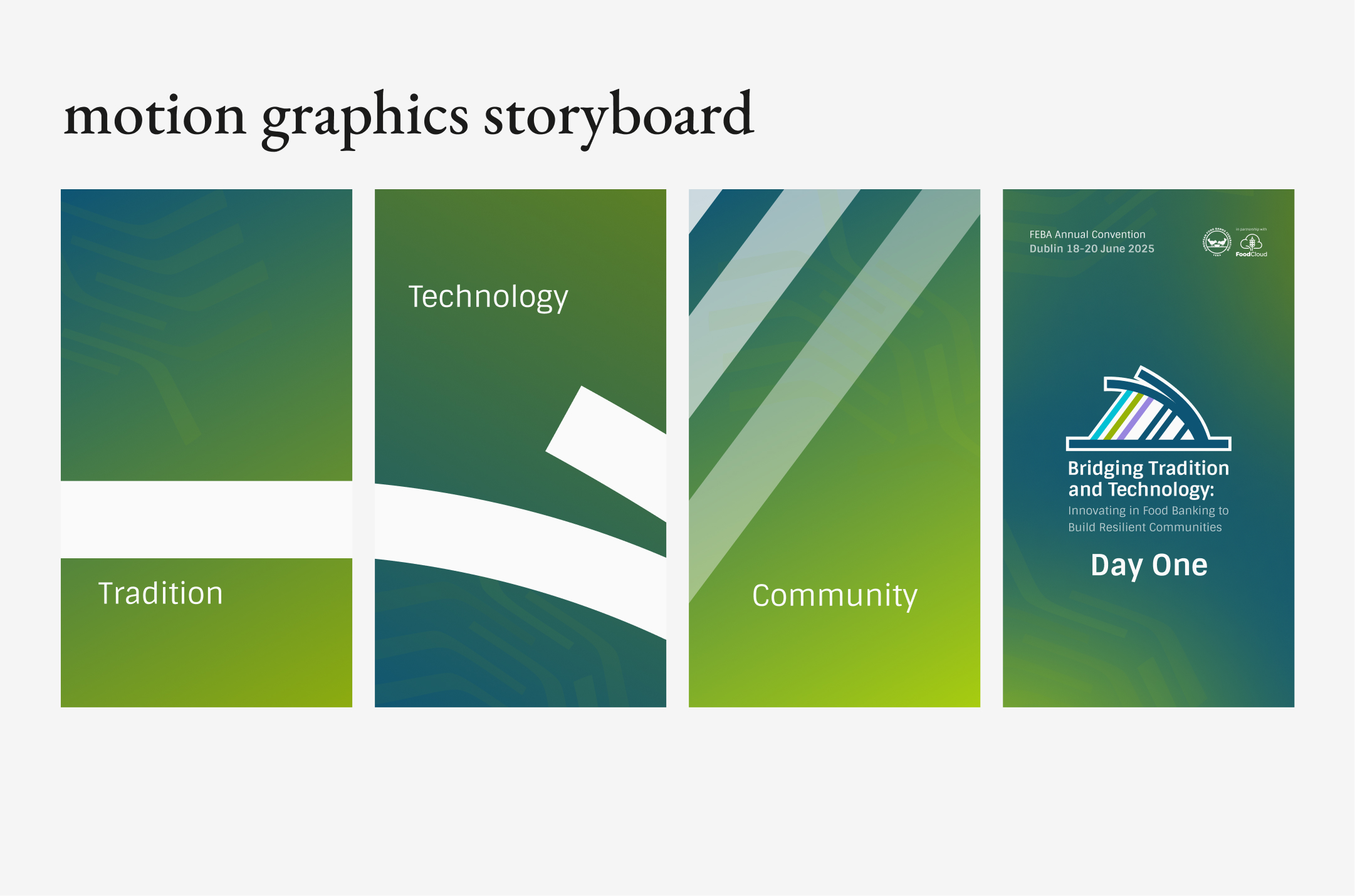
day one - roots & growth
Green reflects the Convention’s connection to Ireland, nature, and the food banking mission. It represents the starting point of the journey - rooted in tradition, with a focus on growth and evolution.
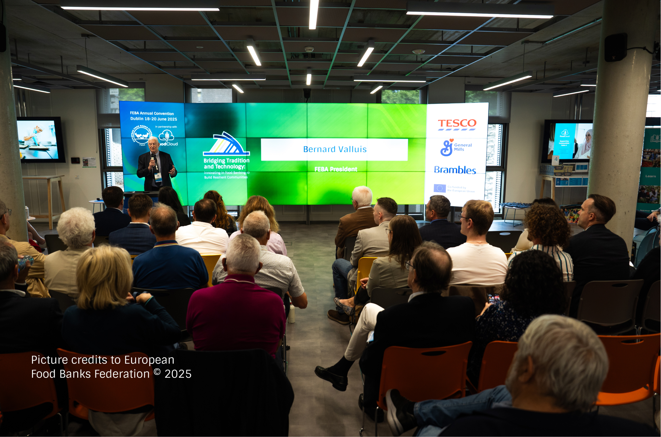
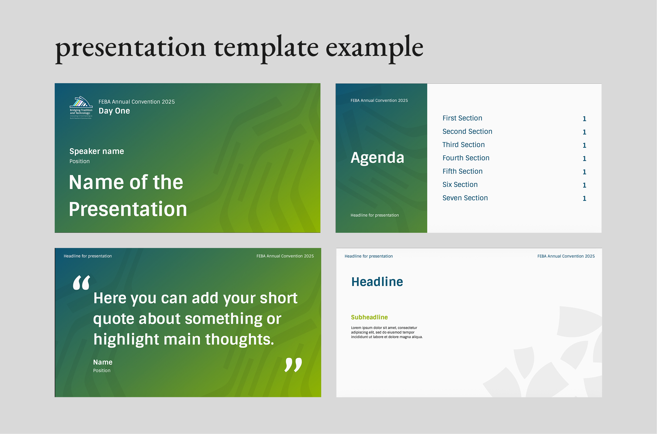
a system that evolves
To create a sense of progression throughout the three-day Convention, each day was given its own color palette and set of visual elements while keeping the core identity consistent.
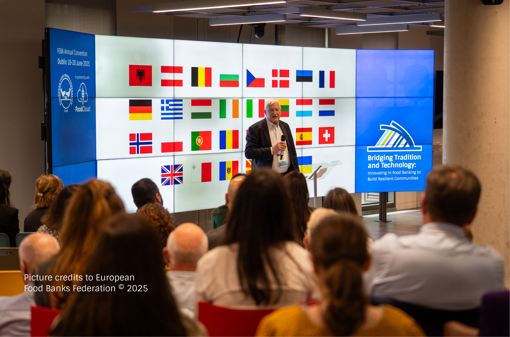
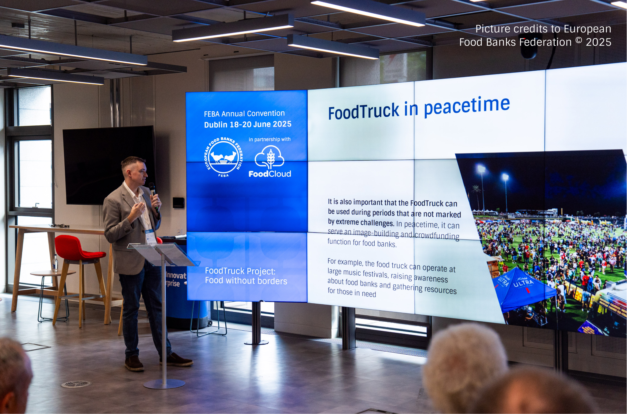
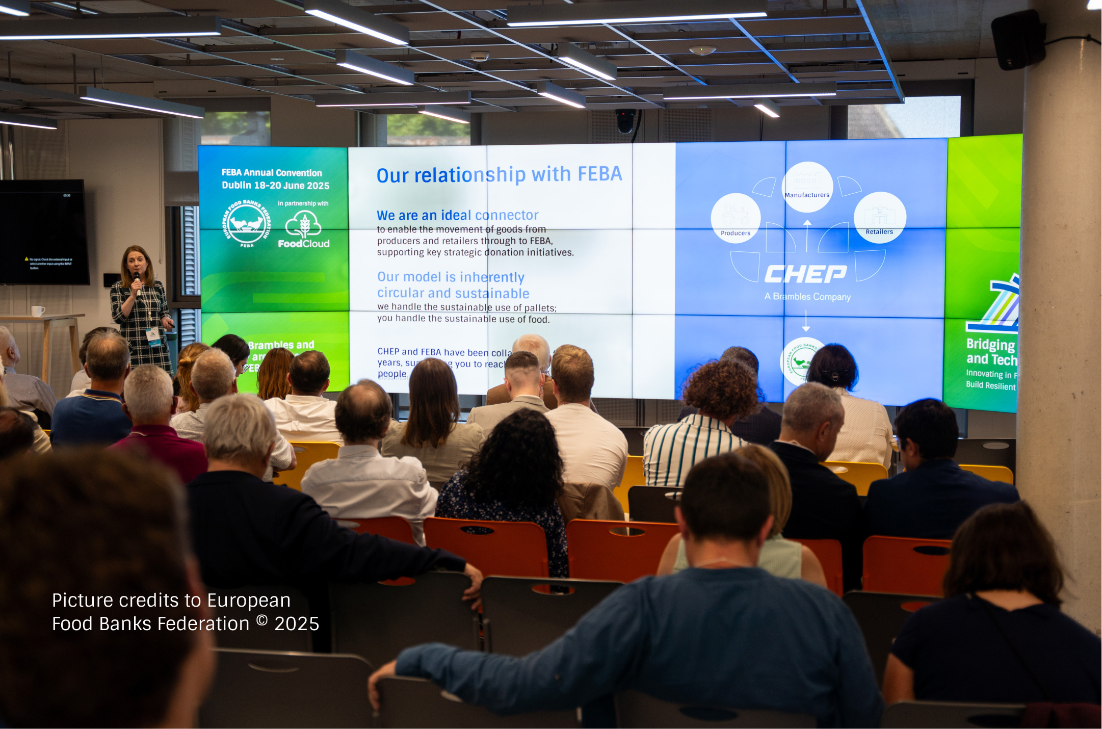
The system evolved from one day to the next across presentations, motion graphics, printed materials, and on-site screens. This created a distinct visual character for each stage of the event while maintaining a continuous and recognizable Convention experience.
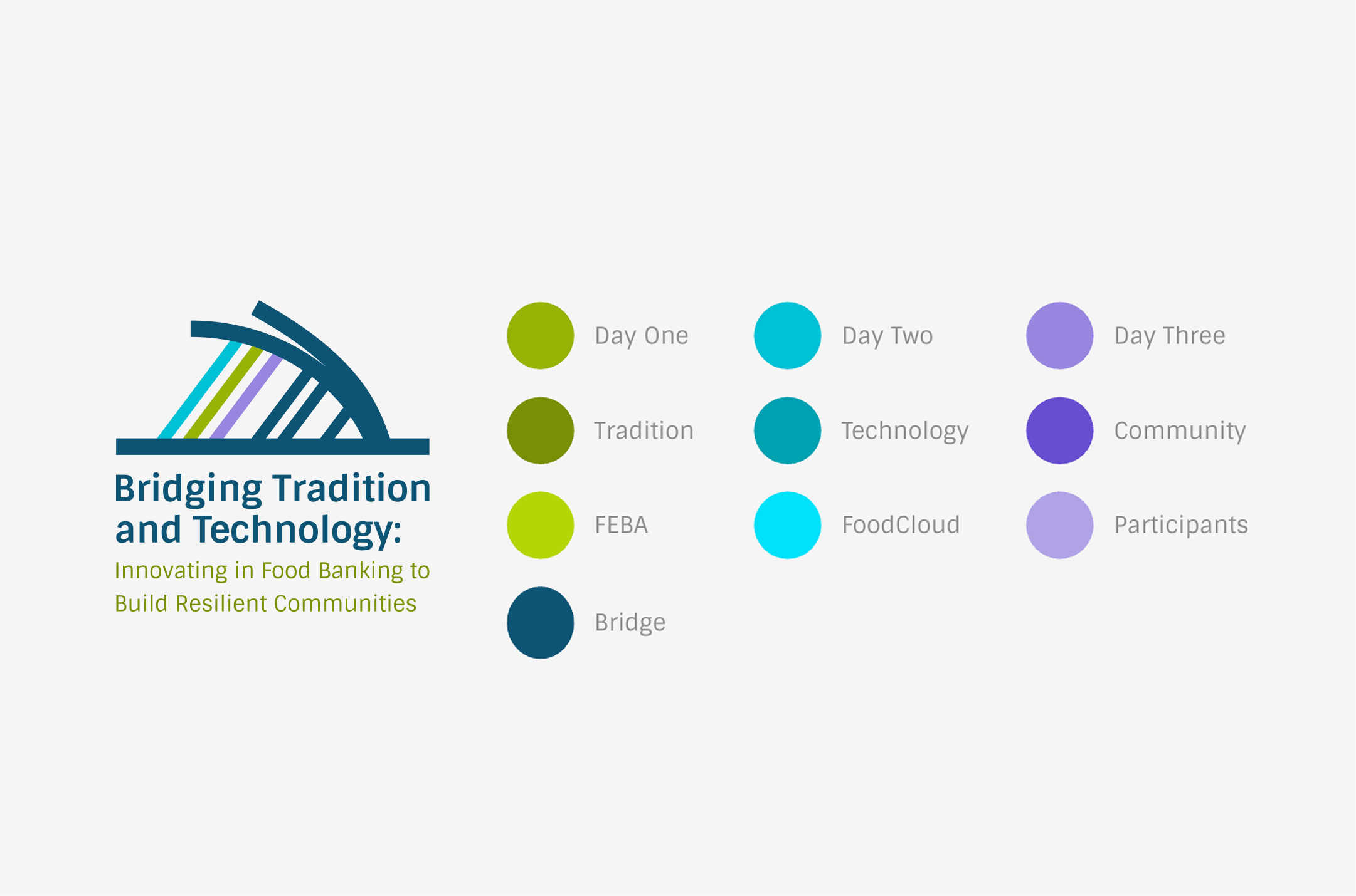
The identity had to work consistently across a wide range of digital, print, motion, and on-site applications while supporting the three-day structure of the Convention. Each day needed its own visual character without breaking the continuity of the overall system.
building one system for a three-day event
challenge #2
graphic language
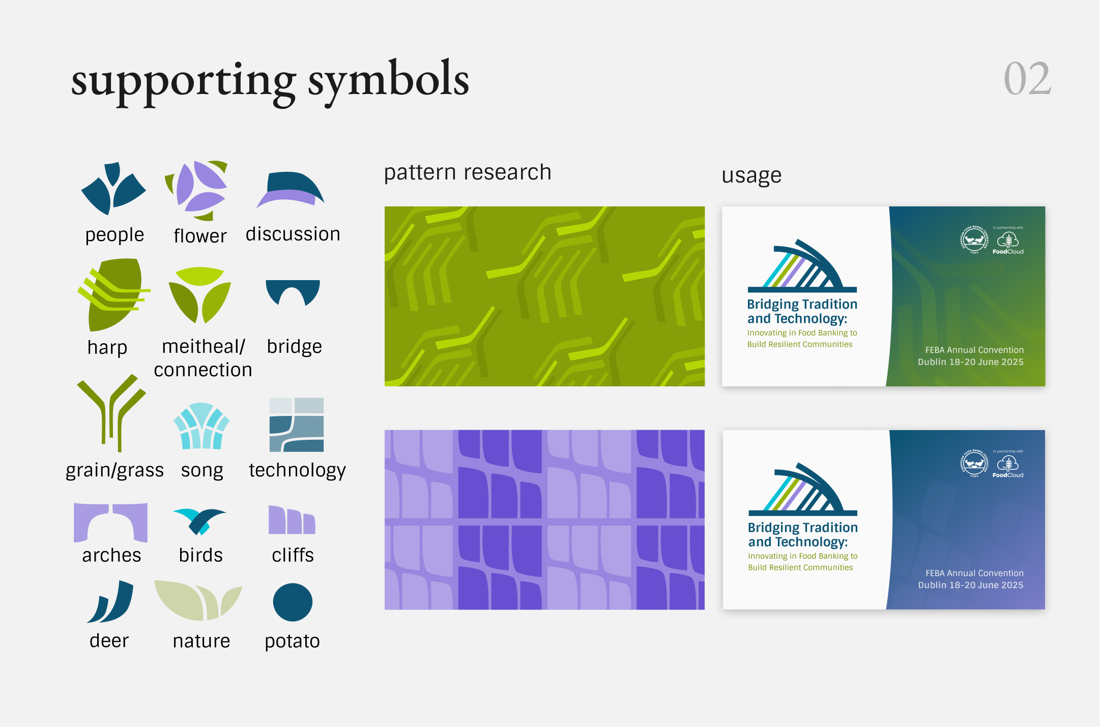
Abstract forms based on connection, rhythm, and movement became the main expressive elements of the identity. Their flexible composition allowed them to shift in scale and arrangement across different applications without losing the overall visual language.
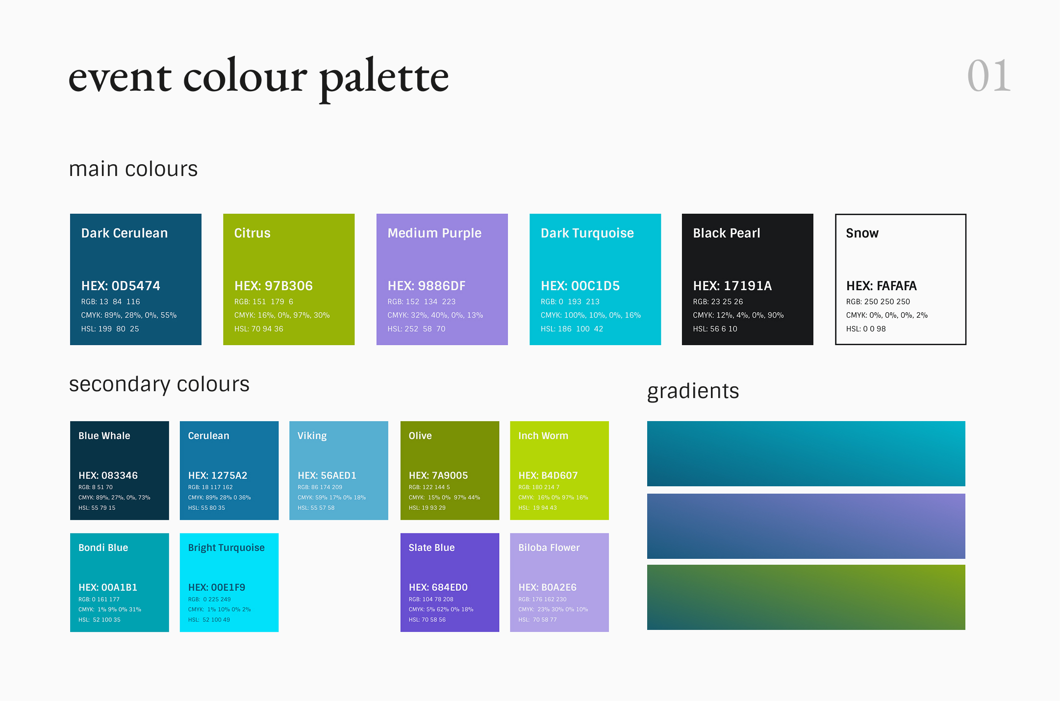
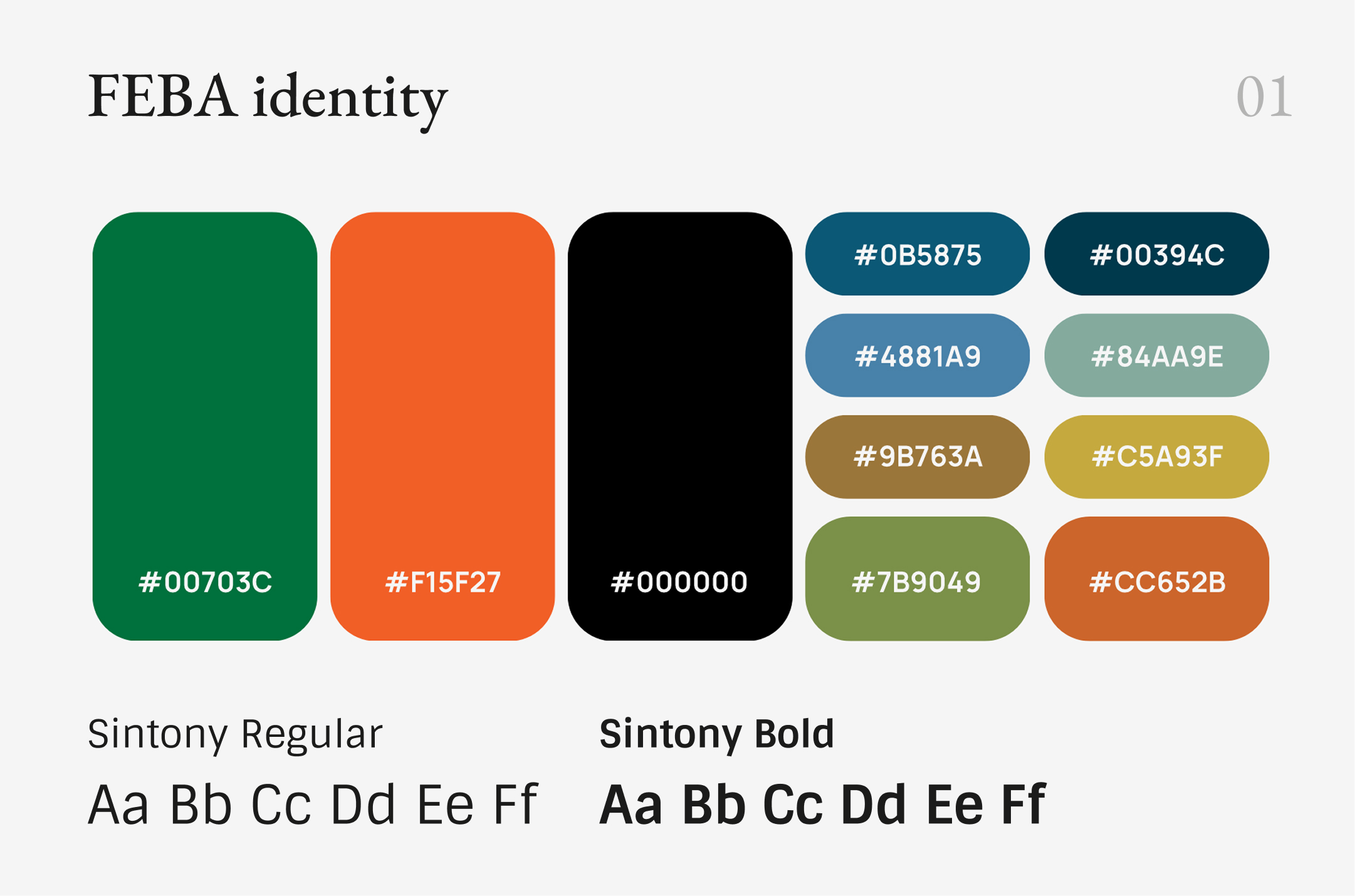
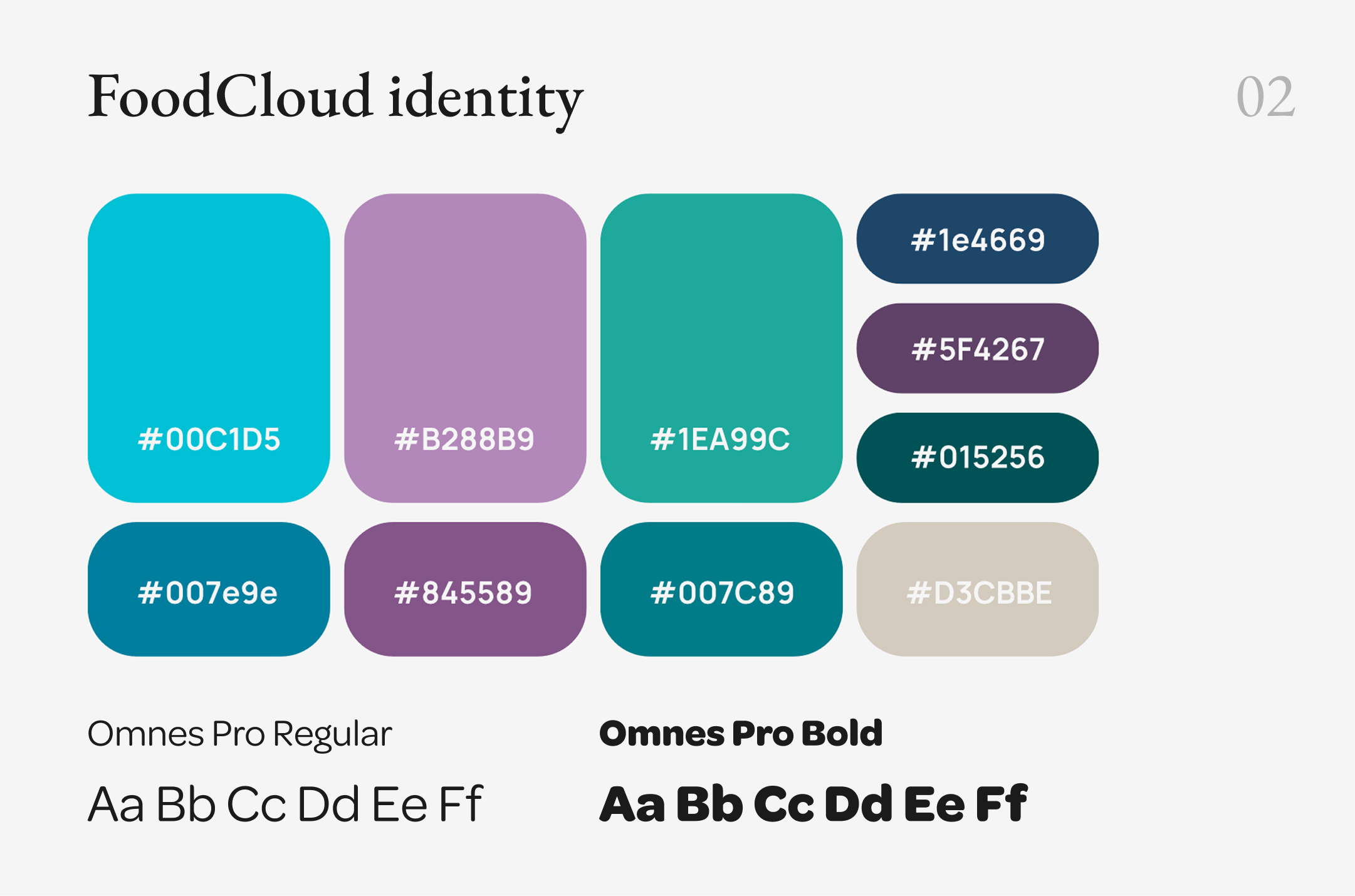
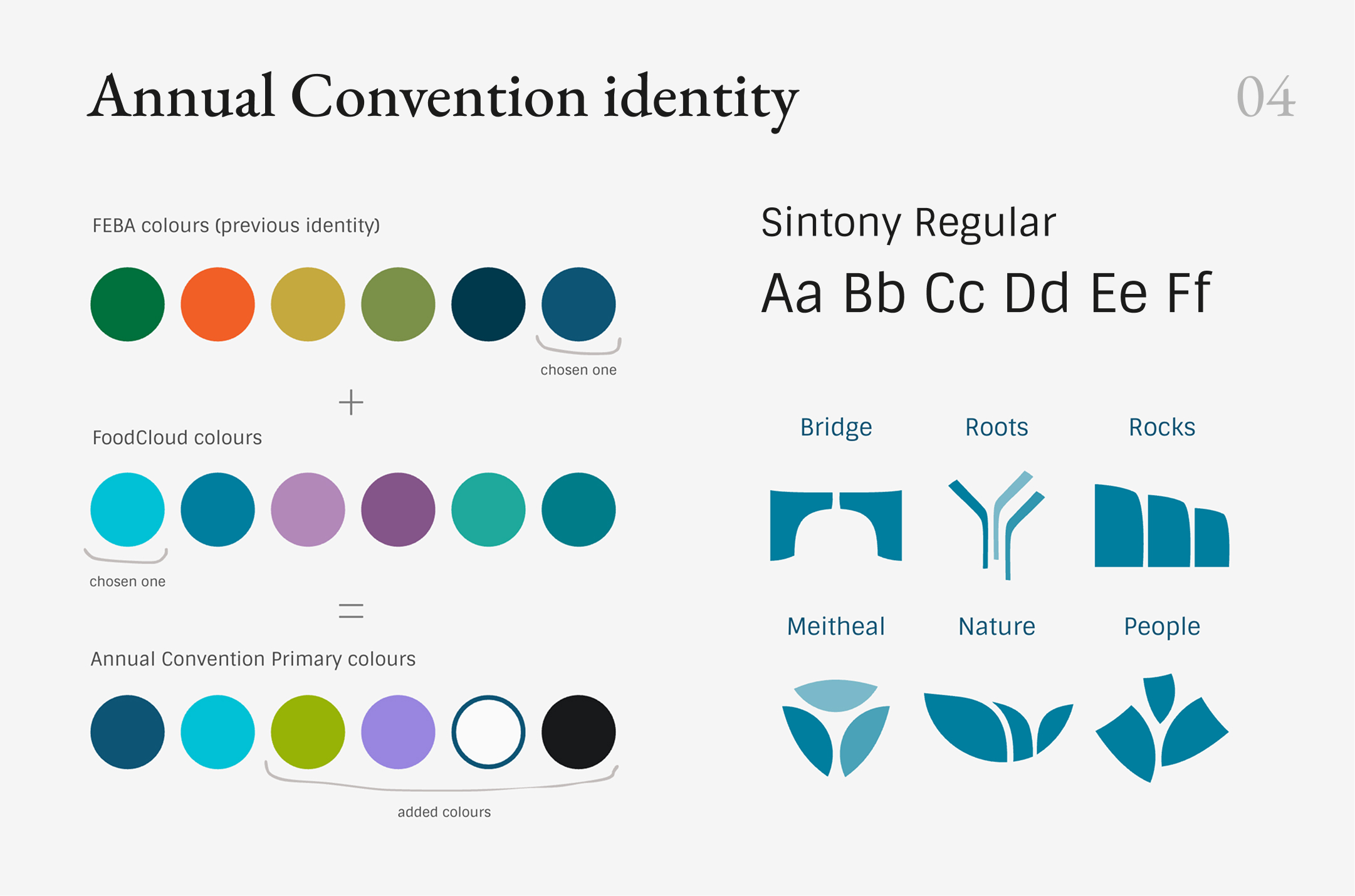
The core palette brings together colors from both FEBA and FoodCloud, extended with additional tones created specifically for the Convention. This allowed the event to establish its own character while remaining connected to both organizations.
color
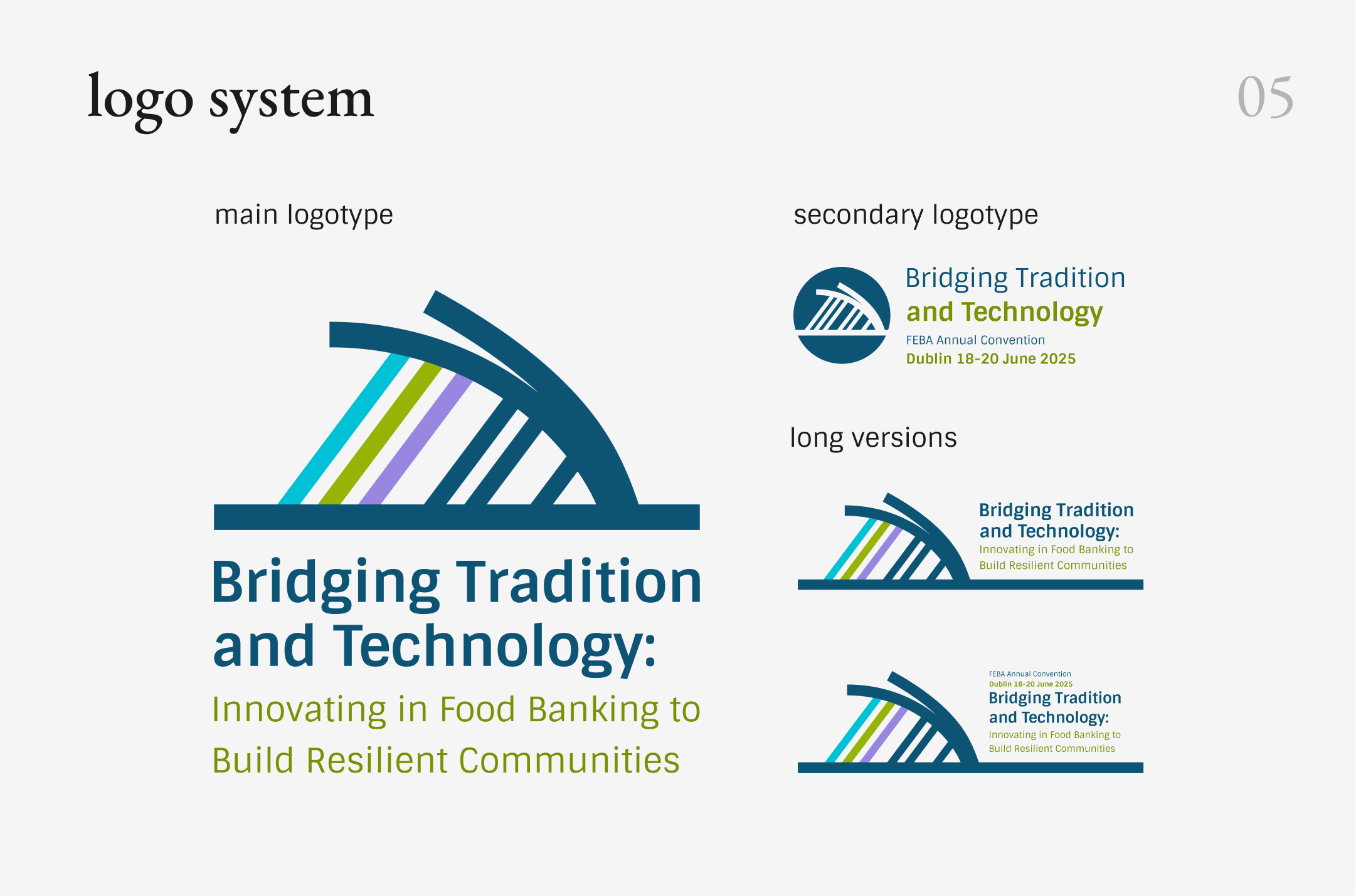
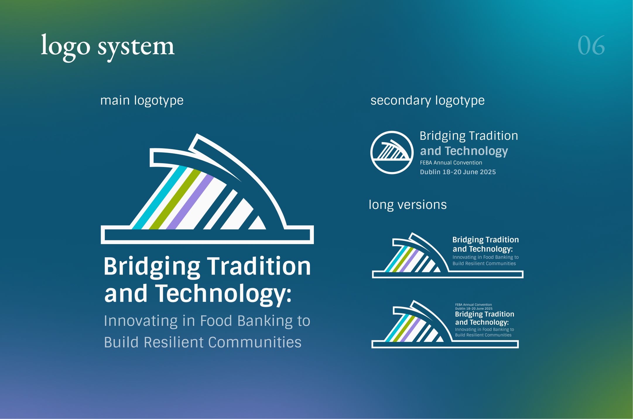
logo system
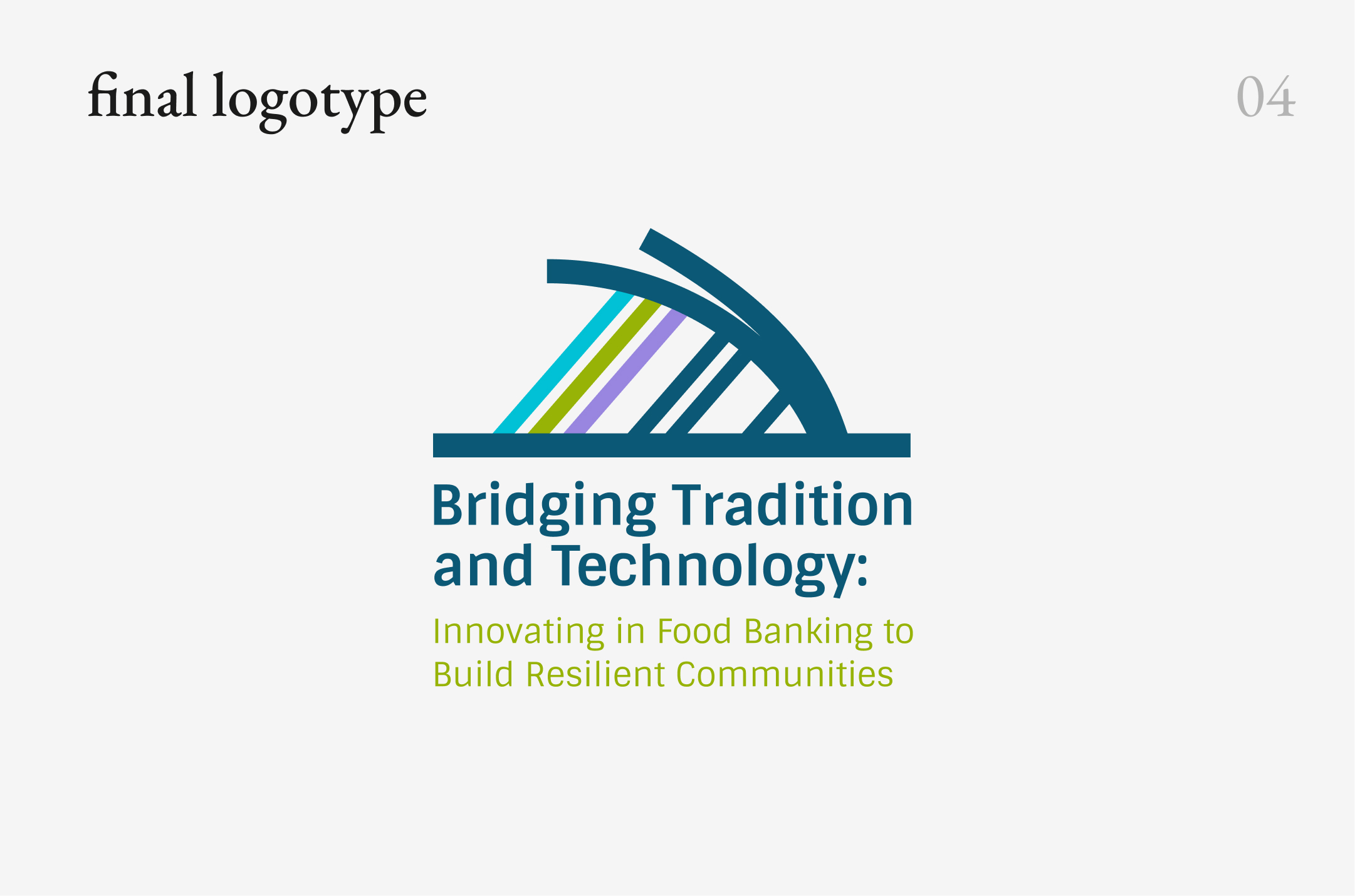
Rather than relying on a single fixed lockup, the Convention identity included a set of logo configurations designed for different proportions, scales, and contexts. This allowed the identity to remain recognizable across everything from compact digital placements to large-format event screens and printed materials.
The identity was built as a flexible system rather than a fixed set of assets. Typography, color, graphic elements, and logo variations were designed to work together while adapting to different formats, scales, and communication needs.
anatomy of visual identity
project overview
from identity to experience
challenge #1
building the visual language
The visual direction started with elements already familiar to the FEBA community. FEBA’s typography provided continuity with the organization’s established identity, while the color palette drew from both FEBA and FoodCloud, expanded with additional colors developed specifically for the Convention.
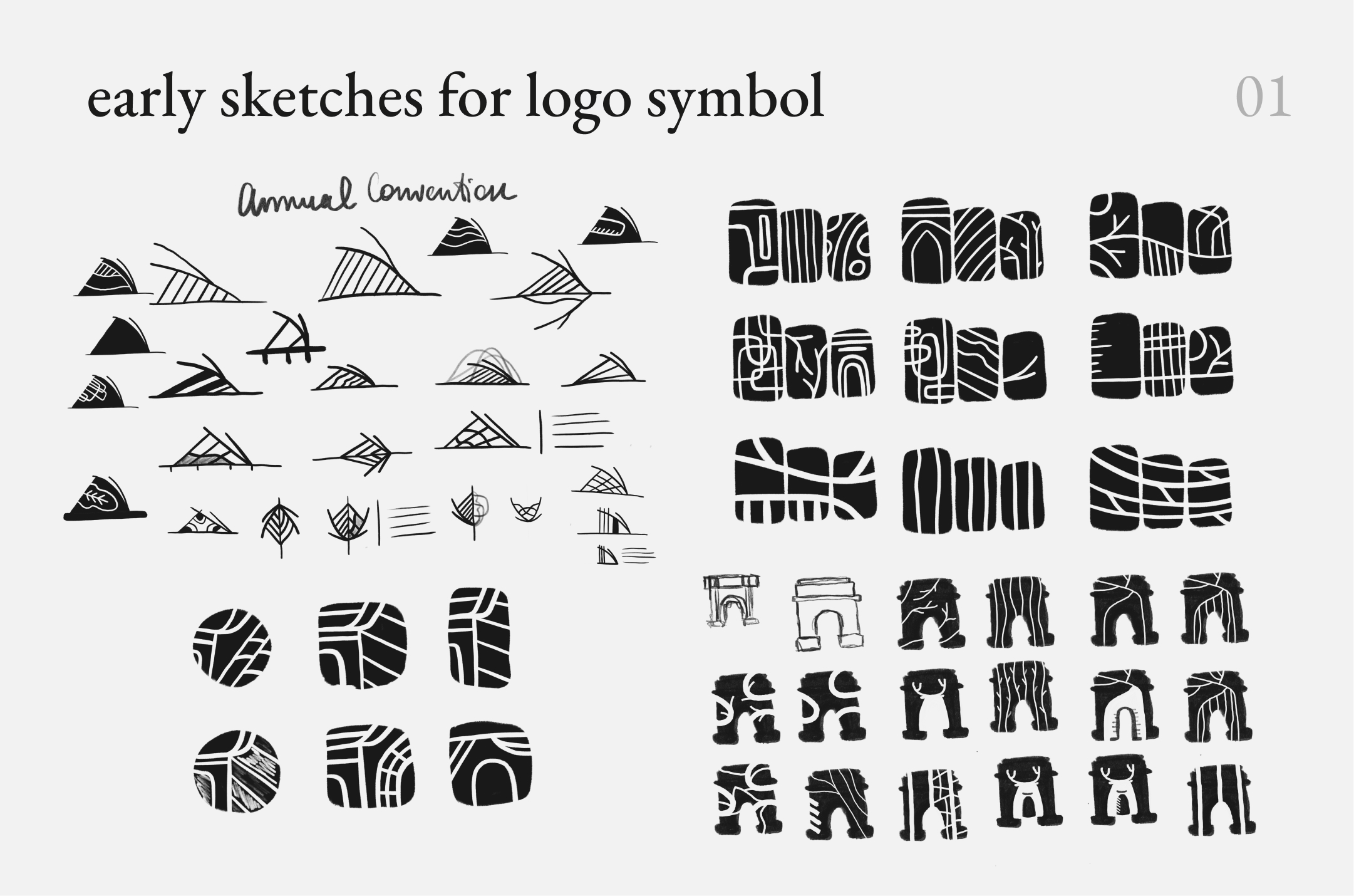
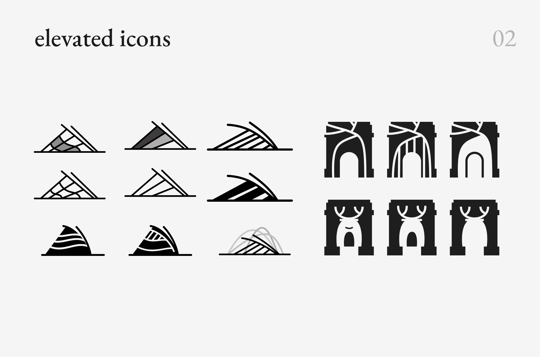
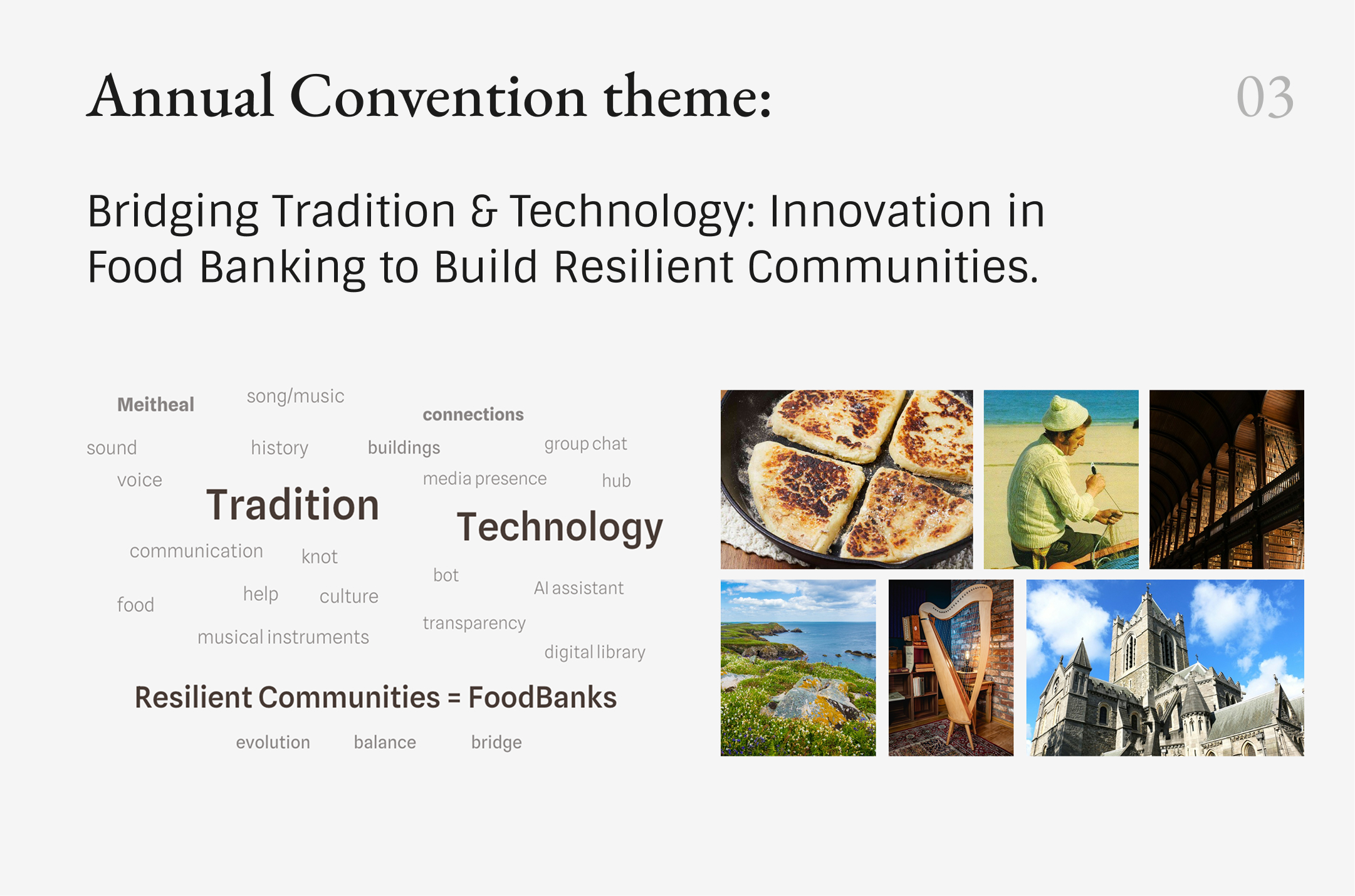
Rather than using literal or stereotypical references to Ireland, the visual exploration focused on the ideas behind the event theme - connection, exchange, community, and the relationship between tradition and technology.
These ideas evolved into a set of abstract graphic elements built around movement, repetition, and connection. Combined with typography and color, they formed a distinct visual language for the Convention while keeping it recognizable as part of the broader FEBA ecosystem.
balancing multiple identities
event design system


event support
where do you want to go next?
tools used
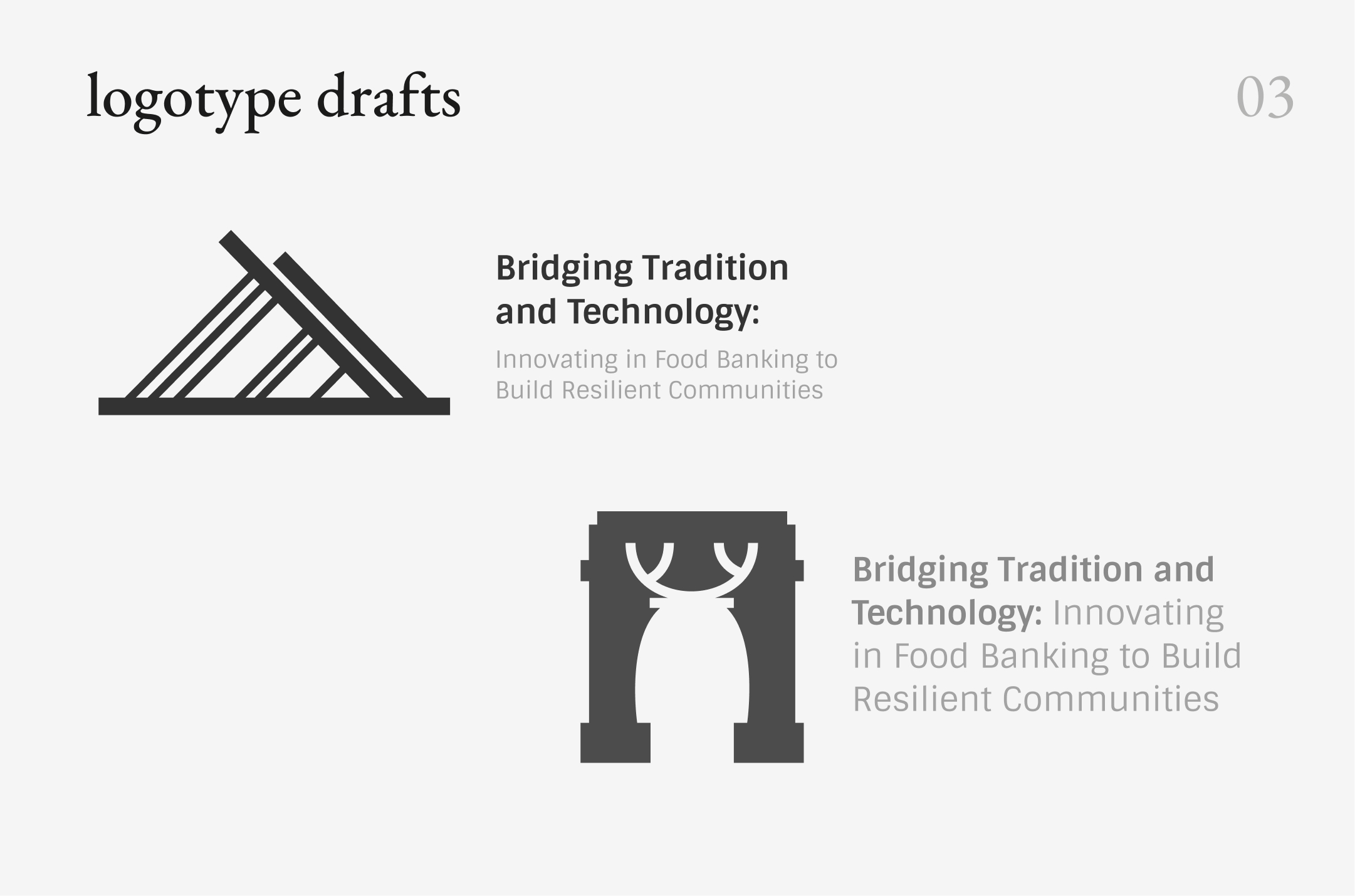
The Convention needed its own recognizable identity while representing both FEBA and the local host, FoodCloud. The visual language also had to reflect its Dublin setting and the 2025 theme, “Bridging Tradition and Technology,” without relying on stereotypical Irish imagery.
presentation design
visual identity
print design
social media templates
services
February - July 2025
project timeline
client
general info
European Food Banks Federation
FEBA annual
convention 2025
FEBA partnered with FoodCloud to host its Annual Convention in Dublin. The project involved developing an end-to-end event design system and applying it across key event touchpoints, including the website, social media, print materials, presentations, motion graphics, and on-site digital screens.