Edward Kucherenko.
All rights reserved © 2026


contact
phone: +380632304280
email: edwardkucherenko@gmail.com
03 / manage account
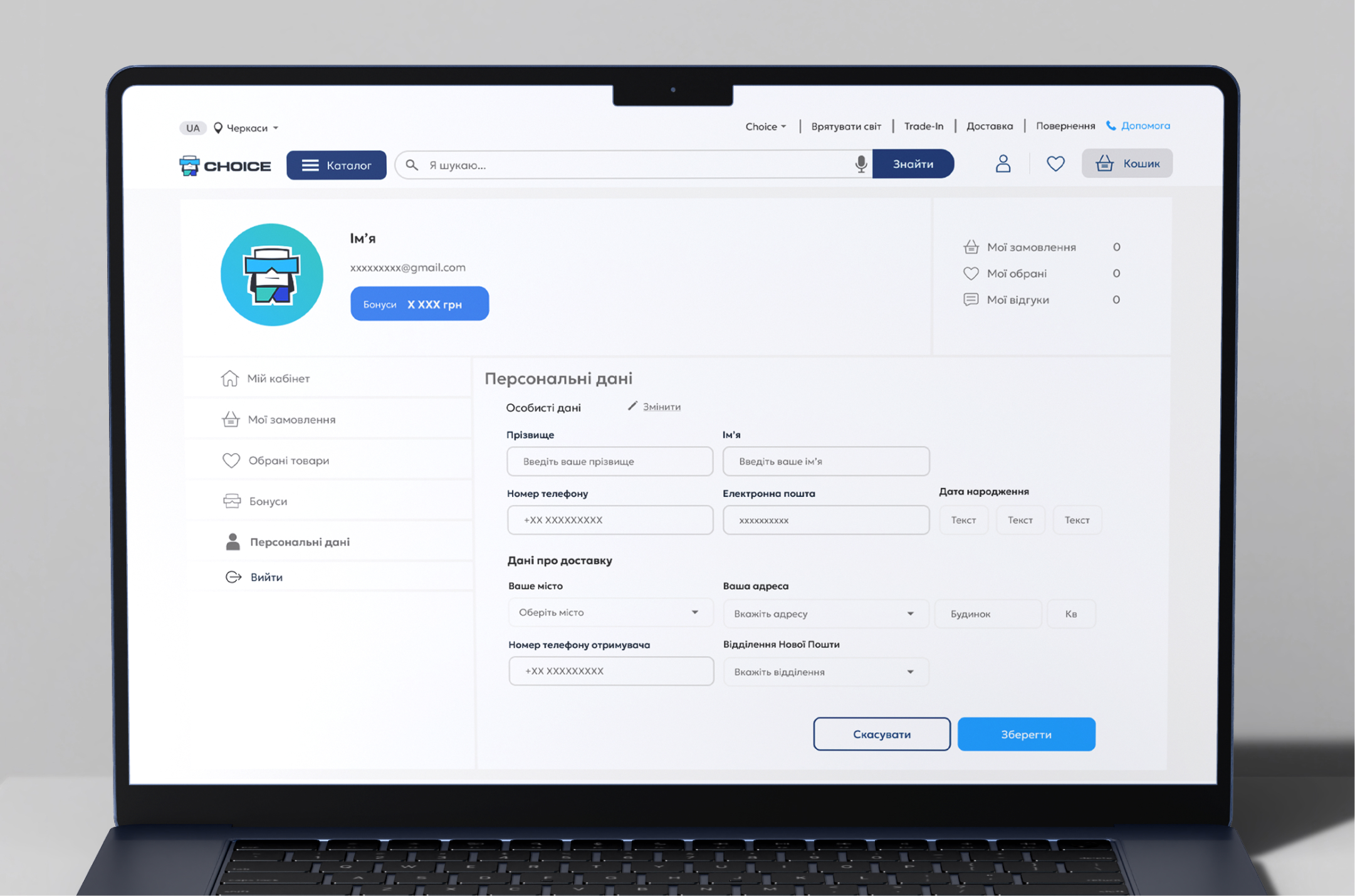
Users could manage their personal and delivery information directly from their account, keeping frequently used details up to date and reducing the need to re-enter them during future purchases.
02 / manage orders
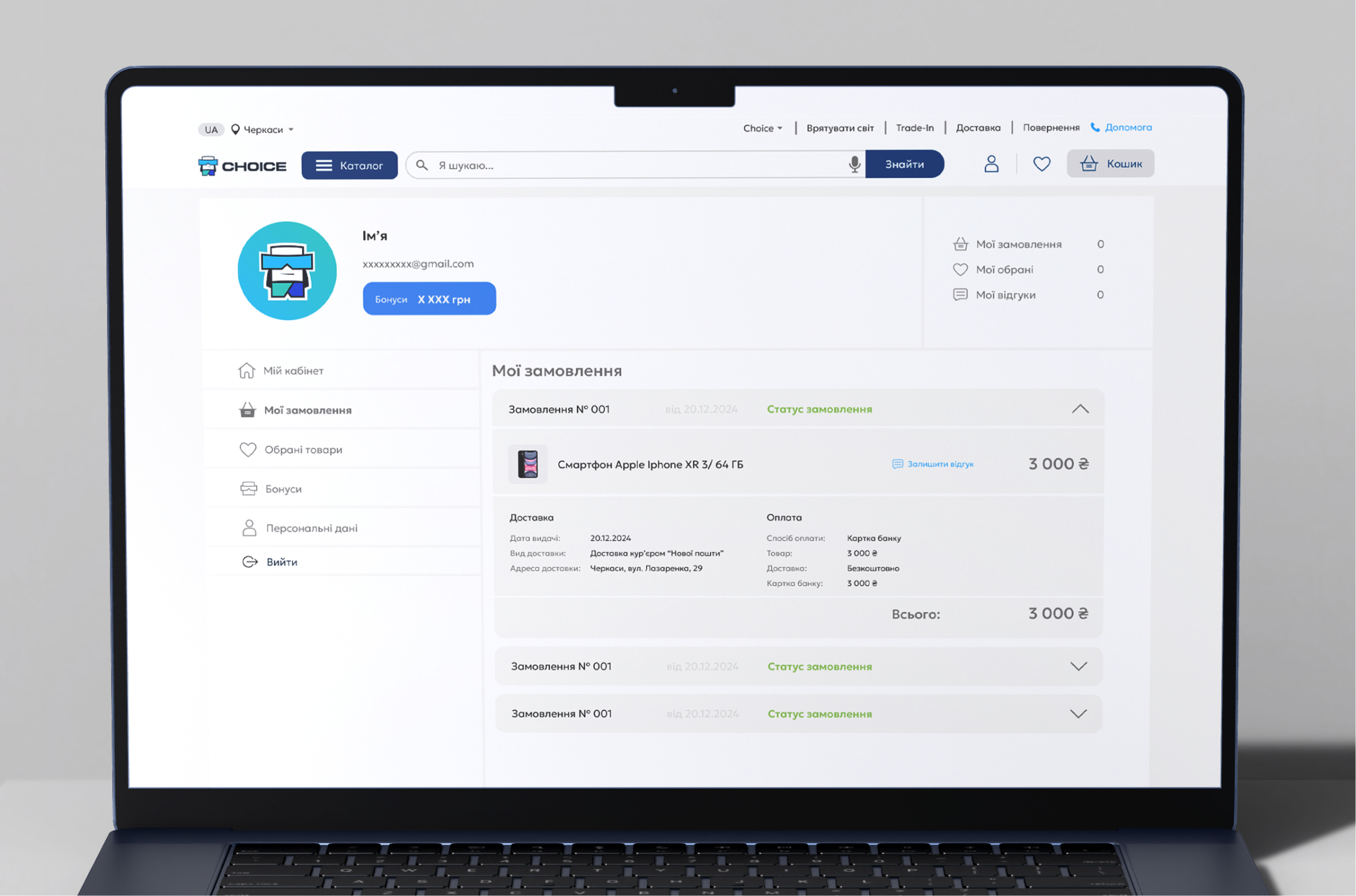
Order management provided users with a single place to review their purchases, check order status, and access delivery and payment details, keeping essential post-purchase information easy to find.
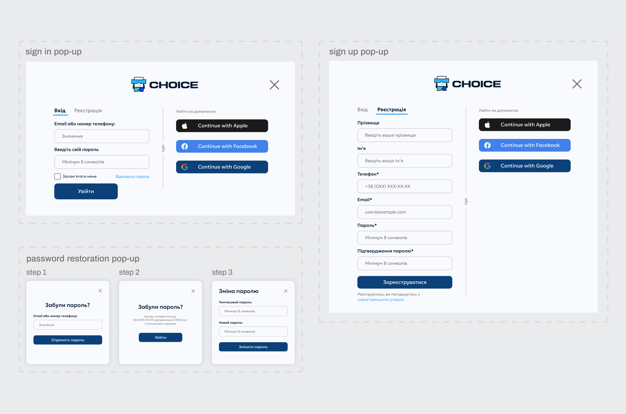
Account access was designed to support both new and returning users through a consistent entry point. Users could sign in or create an account using their credentials or social authentication, with password recovery integrated into the same flow.
01 / Create & Access Account
Beyond the core shopping journey, the experience needed to support users in managing their accounts and existing orders. This included access to order details, tracking, and personal account settings within a consistent post-purchase experience.
Order & Account Management
step #4
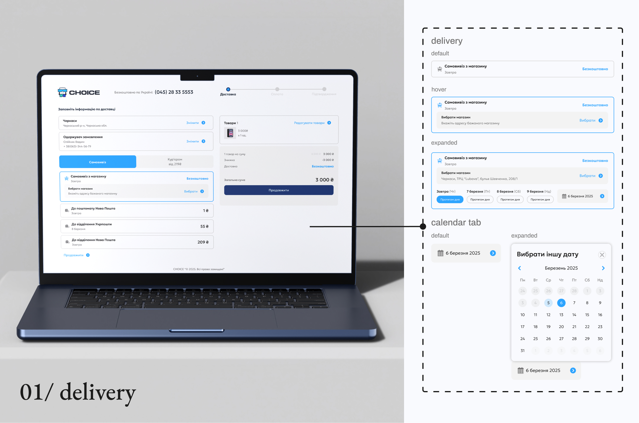
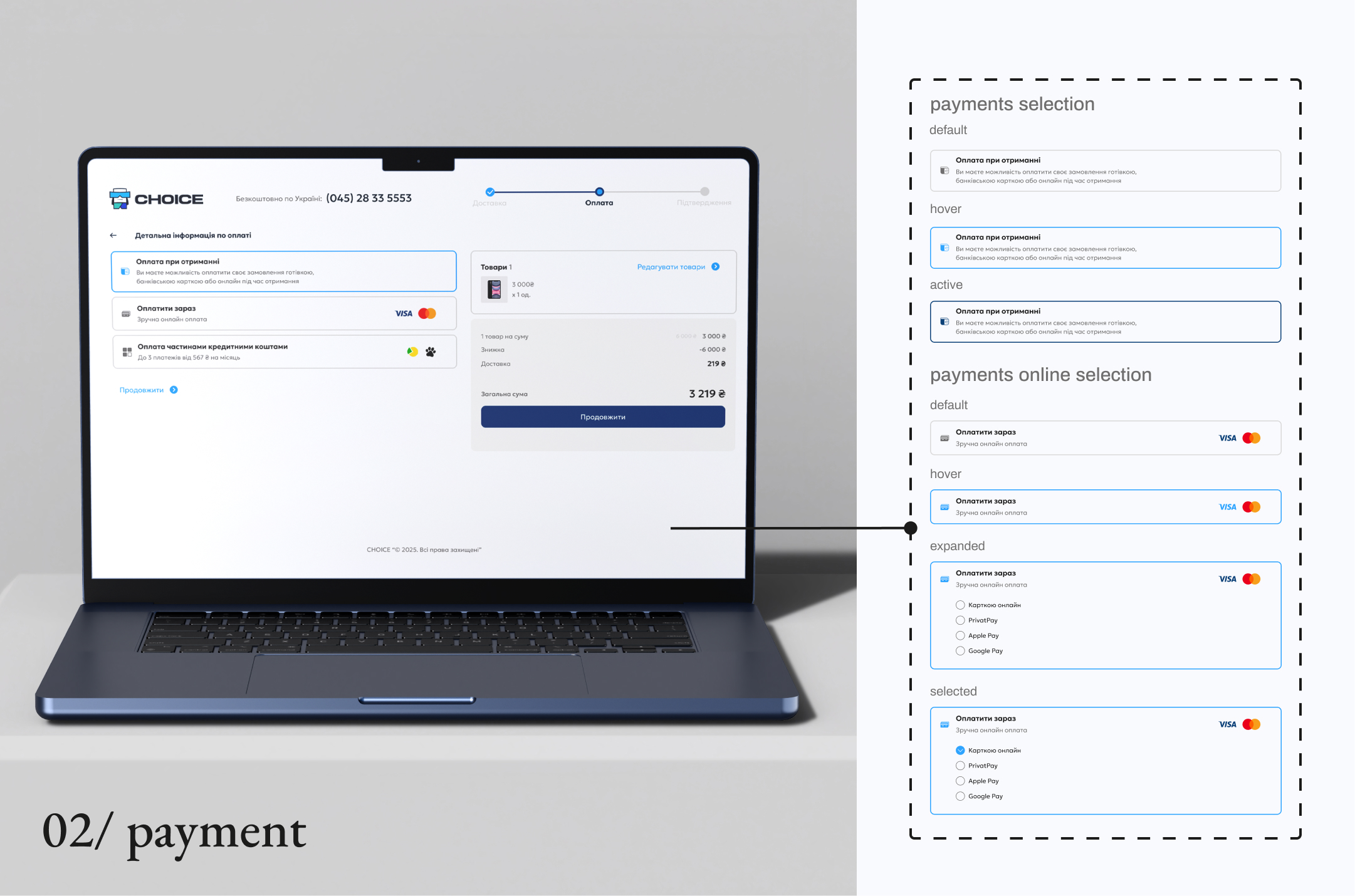
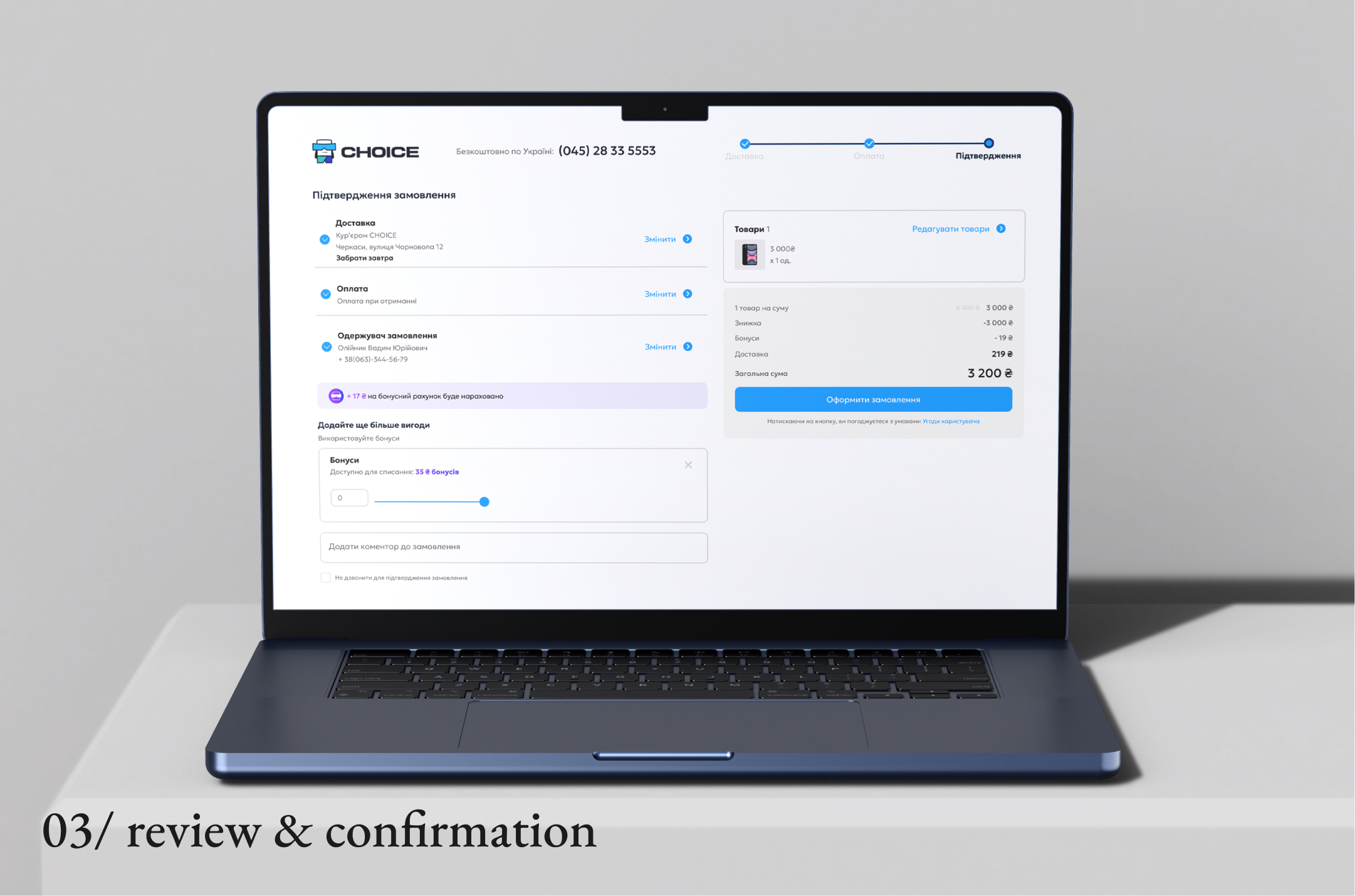
The checkout was structured as a clear three-step flow: delivery, payment, and final review. Each step focused on one decision at a time, while keeping the selected items, costs, and order summary visible throughout the process.
Before placing the order, users could review and adjust their choices, apply available bonuses, and confirm all essential order details in one place.
06/complete the checkout
The product structure defined earlier now becomes part of the customer’s decision-making experience.
05/add to cart
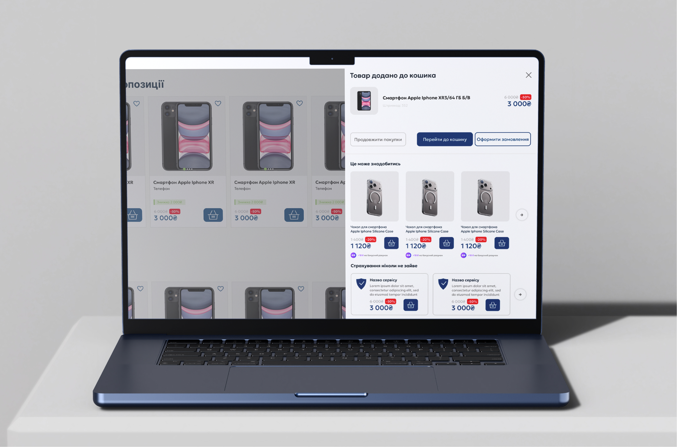
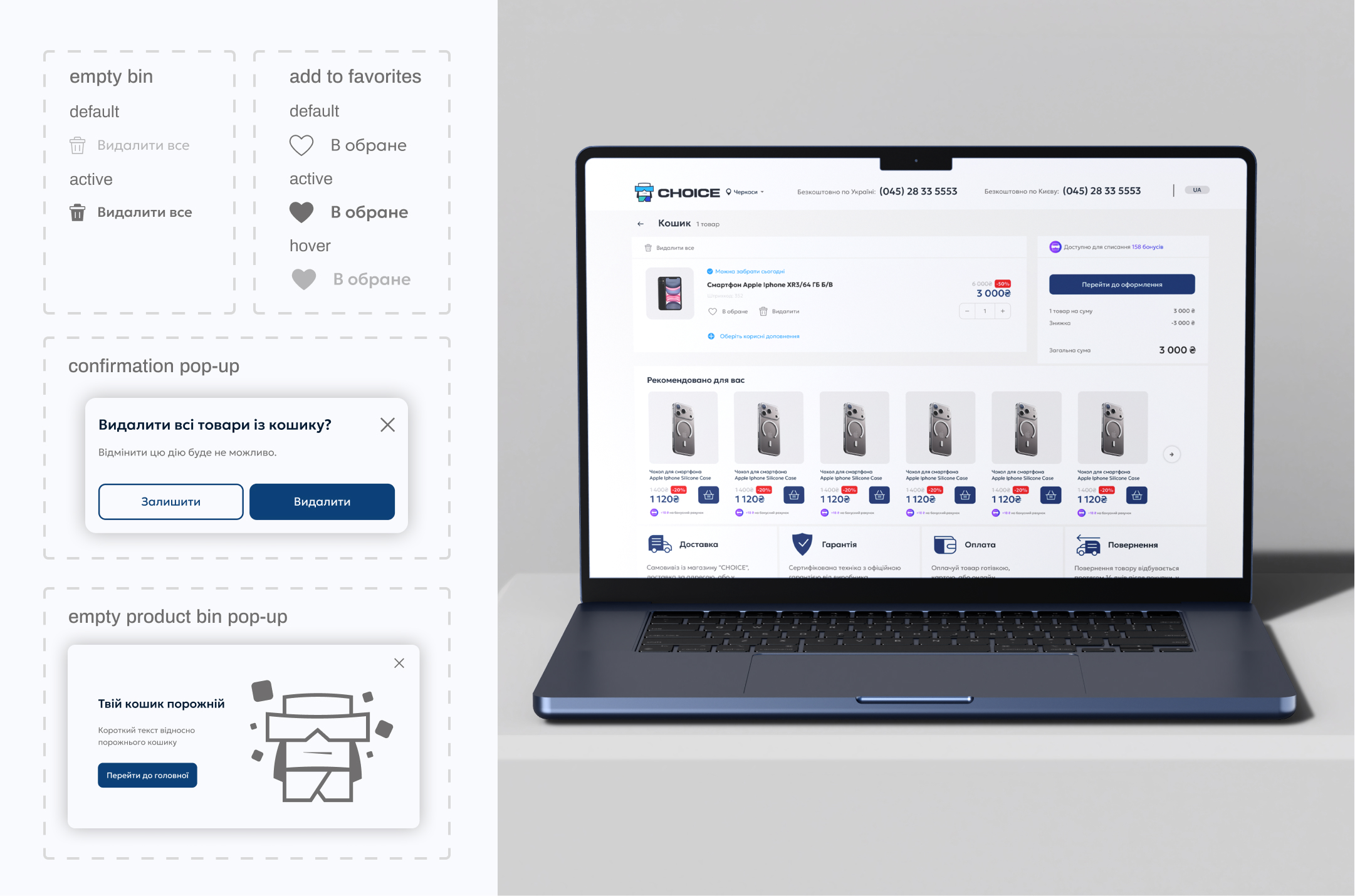
Adding an item to the cart was designed as a continuous step rather than an interruption to the shopping journey. After adding a product, users could continue browsing, review their cart, or proceed directly to checkout.
The cart then provided a clear overview of selected items, pricing, and available actions, while supporting recommendations and additional purchase options without blocking the path to checkout.
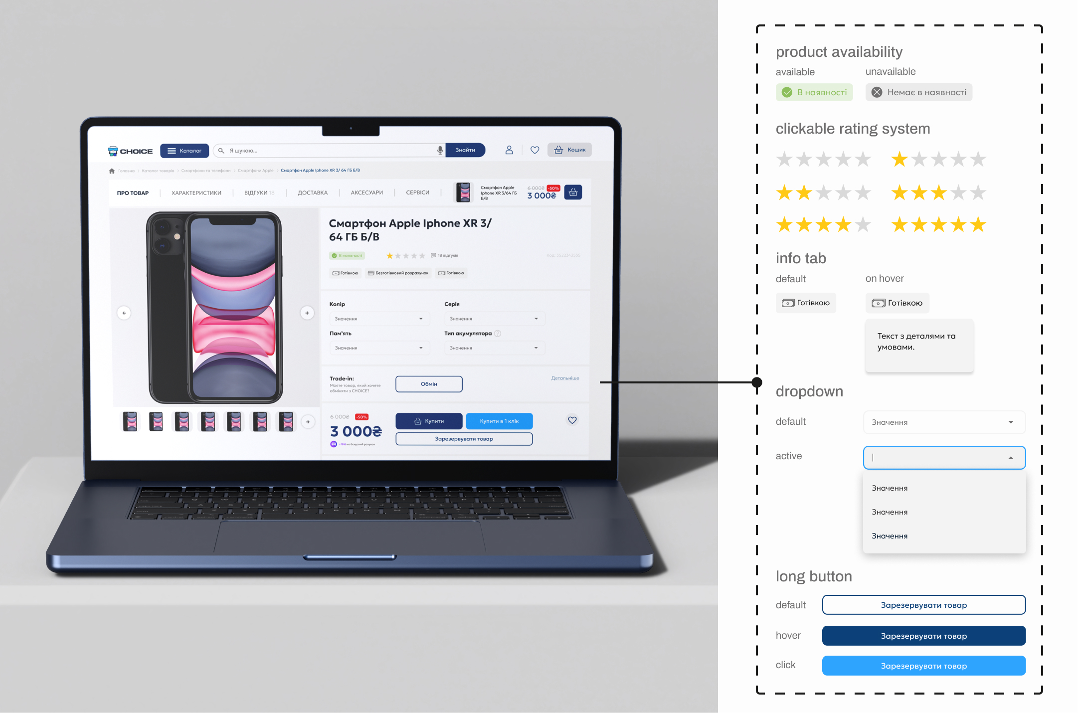
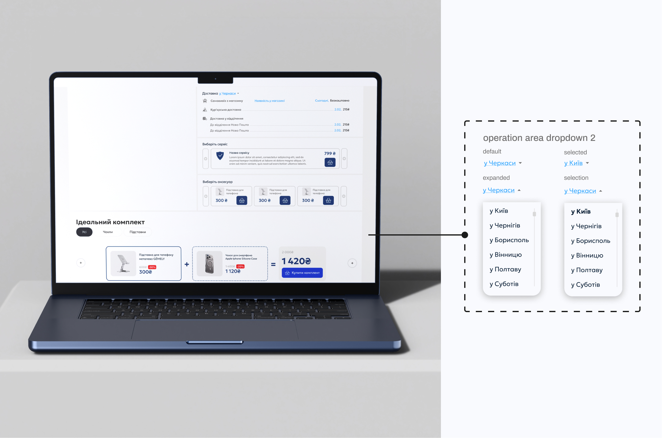
For pre-owned products, the decision goes beyond comparing price and specifications. Users also need to understand the condition of the specific item, what is included, its availability, and the options surrounding the purchase.
The product page brings this information together in one place, while additional services, delivery options, accessories, and related offers remain accessible without distracting from the primary purchase decision.
04/review the item
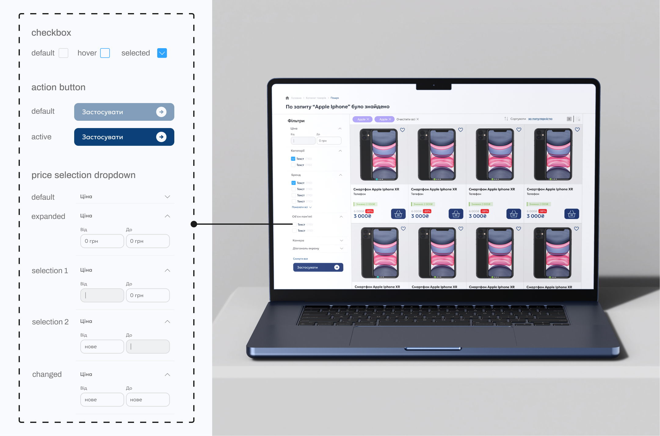
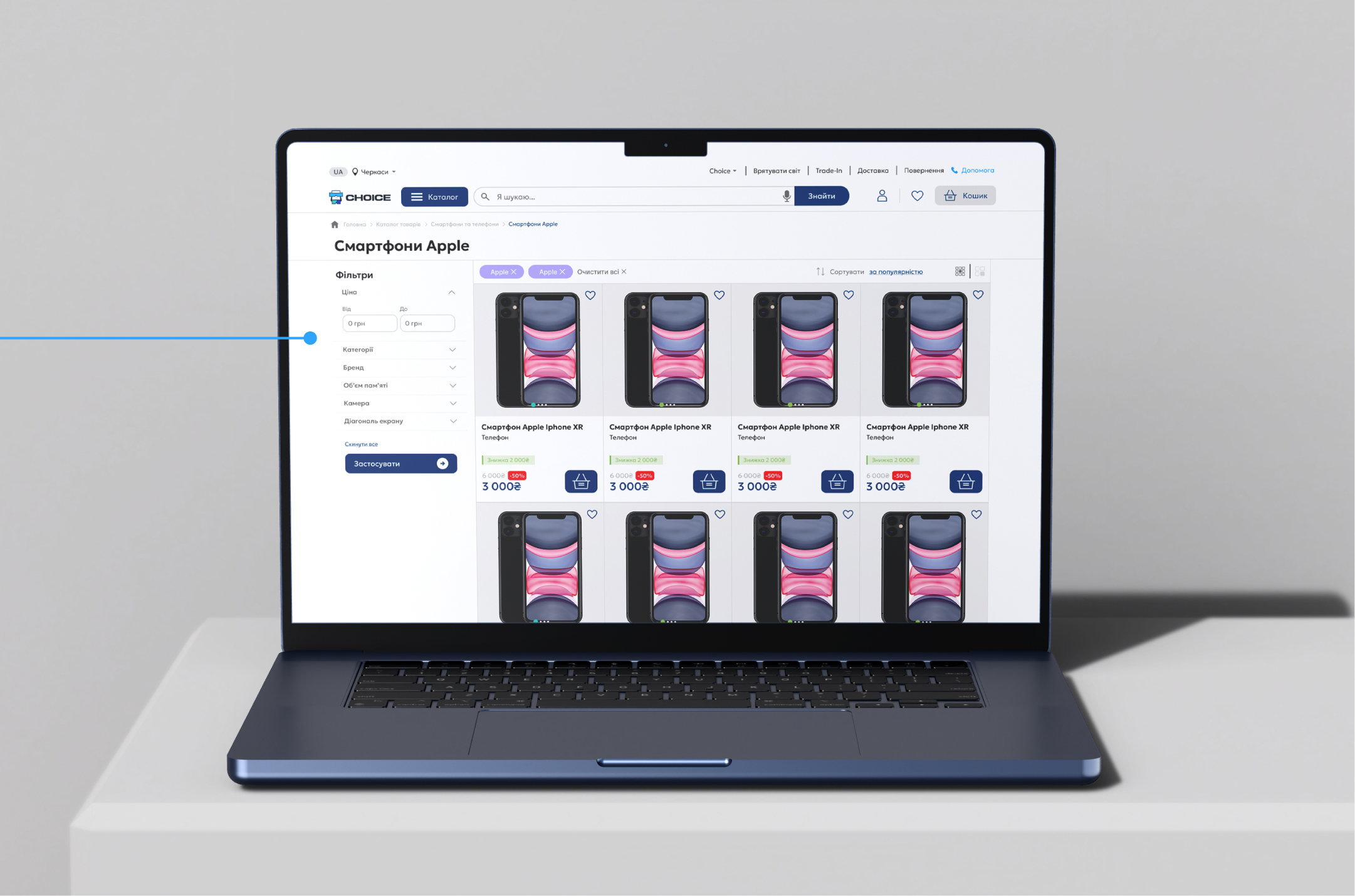
Once users reached the results page, filtering helped narrow the selection based on attributes relevant to the chosen product category. The product structure defined earlier became the foundation for these filters, keeping the experience consistent while allowing different product types to expose different criteria.
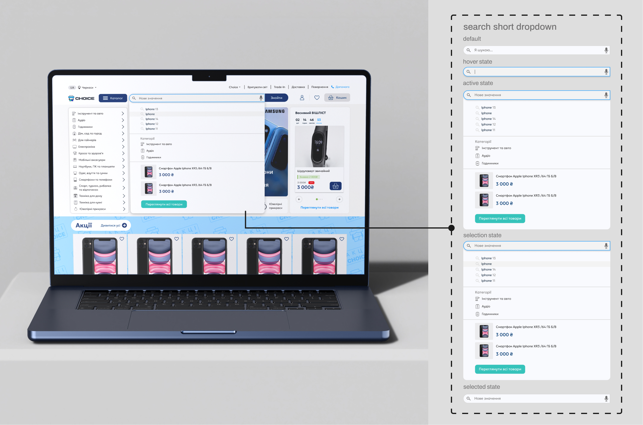
03/define the search
Search provided a direct path for users who already knew what they were looking for. As they typed, suggestions surfaced relevant queries, categories, and individual products, helping users reach the right part of the catalog with fewer steps
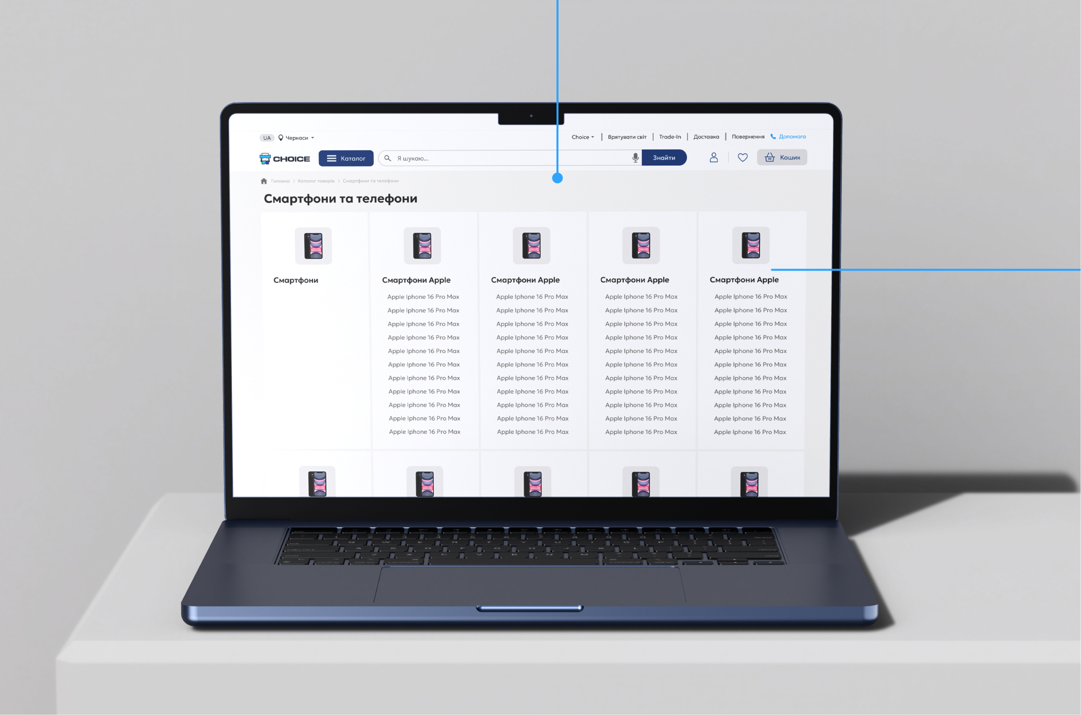
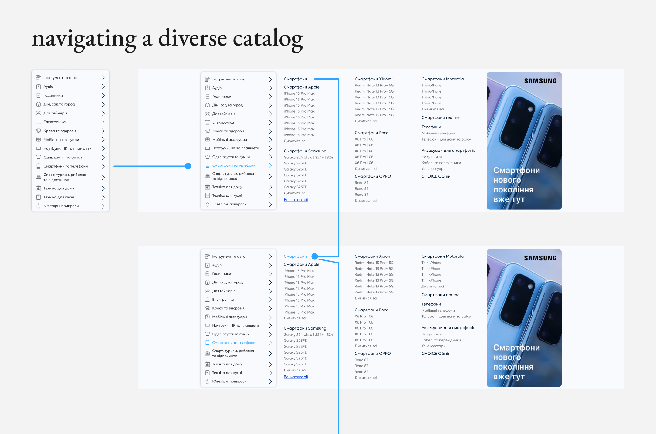
The catalog translated the underlying product structure into a clear browsing experience. Categories and category-specific filters allowed users to progressively narrow a diverse inventory and focus only on the attributes relevant to the product they were looking for.
02/Find the Right Item
Once inside the catalog, users needed a way to narrow a broad and constantly changing inventory. Category-specific filters exposed only the attributes relevant to the selected product type, helping users progressively move from a broad selection to the items that matched their needs.
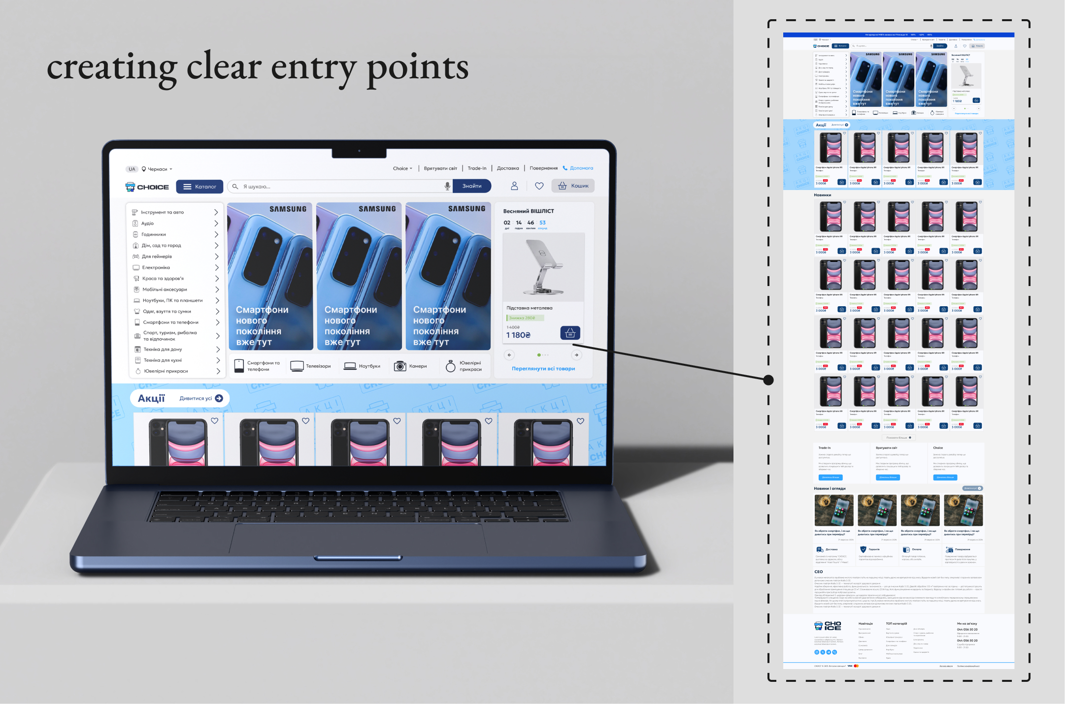
The shopping experience was designed to support different starting points. Users could explore the catalog through its category structure, discover featured products, or move directly to search when they already had something specific in mind.
The taxonomy defined earlier became the foundation for catalog navigation, turning a diverse inventory into clear and predictable entry points.
01/Discover Products
step #3
Designing the Core Shopping Experience
With the product structure and core user journeys defined, the next step was translating them into the actual shopping experience.
The primary flow was designed around the key decisions a customer makes when purchasing a unique pre-owned item: discovering available products, finding the right one, evaluating its condition and details, and completing the purchase.
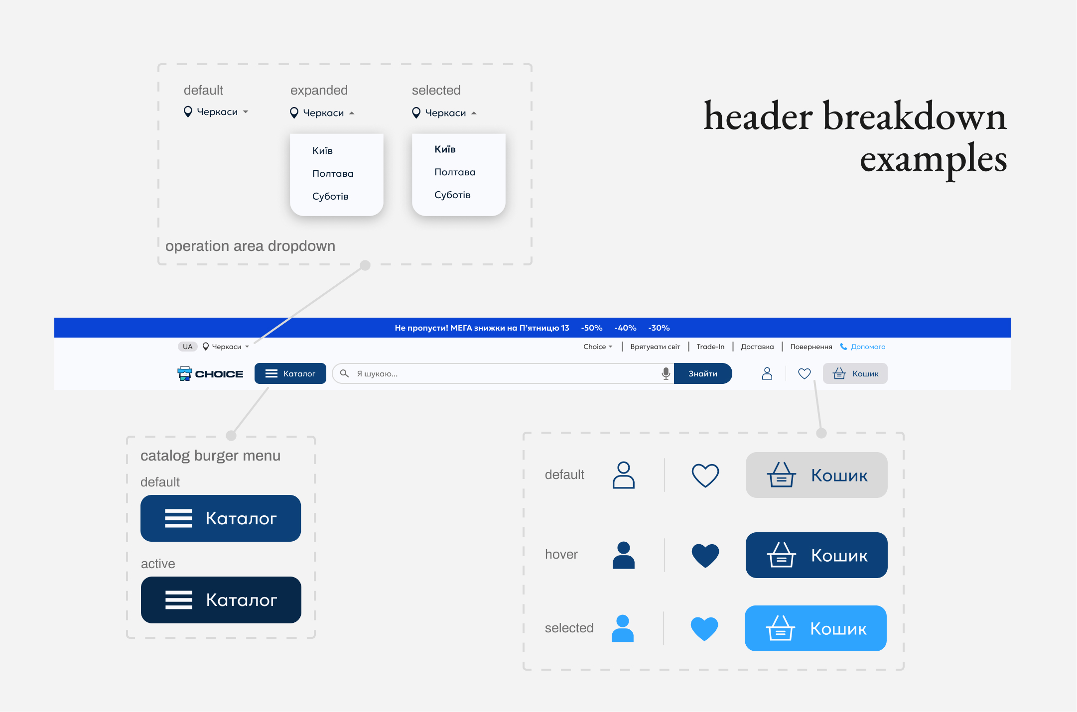
The core user journeys became the foundation for the site navigation. Key entry points - catalog, search, account, and cart - were brought into a single persistent header, giving users direct access to the platform’s primary actions.
Each element was designed as a reusable component with states covering the interactions required across the shopping experience.
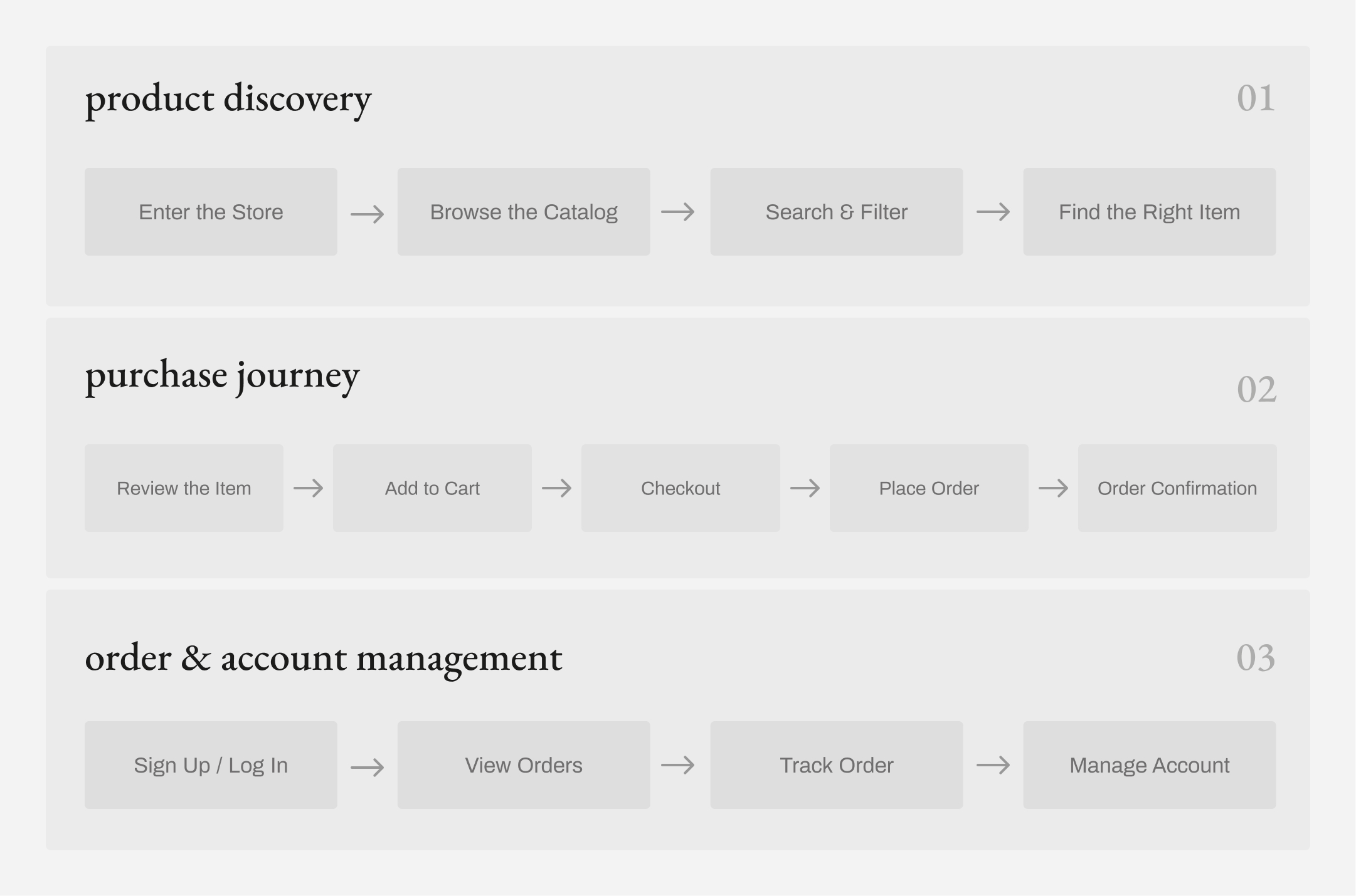
The resulting structure created a consistent foundation for the catalog while remaining flexible enough to accommodate different product types and their specific attributes.
With the inventory structured, the next question was: how would users navigate it?
Define the User Journey
step #2
Developer Handoff
Design System
Design Documentation
Designer
Development team
Client / Stakeholder
team
role
Lead UI/UX Designer
Component Library
User Flows
project overview
scalable e-commerce product
step #1
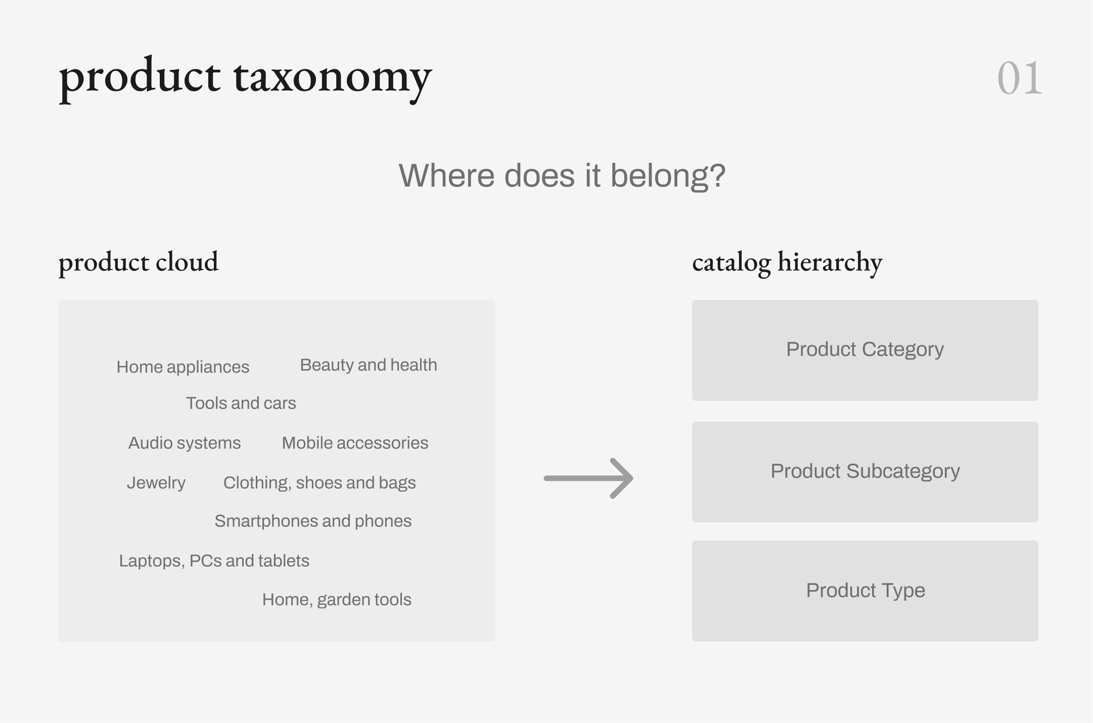
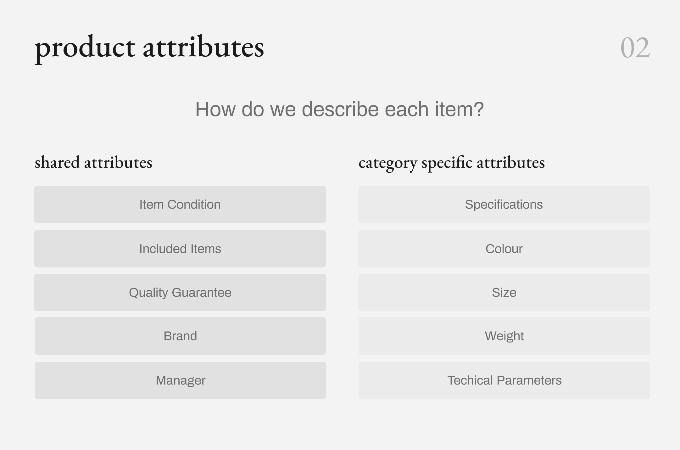
This structure created a consistent foundation for a highly variable catalog. Shared attributes kept product information predictable across the platform, while category-specific attributes preserved the details users would need to evaluate different types of products.
With the catalog structure defined, the next step was to determine how users would navigate it.
Making Sense of the Inventory
ui/ux design

Product Categorization
where do you want to go next?
tools used
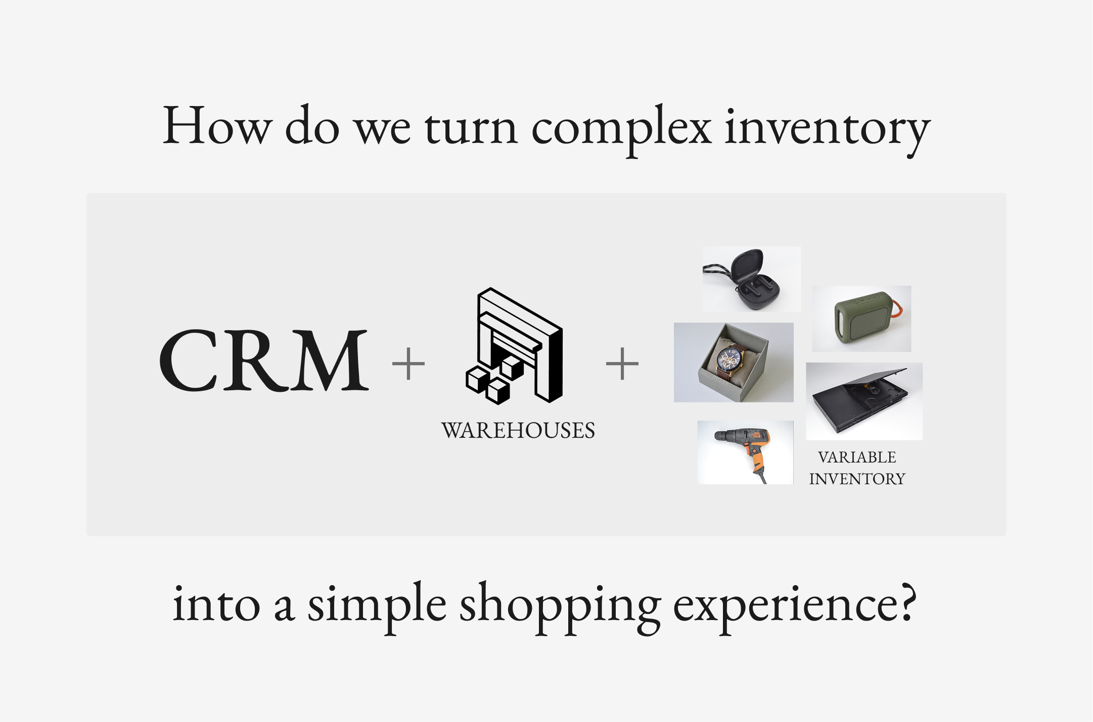
Choice’s existing business infrastructure was built around a CRM, multiple warehouses, and a constantly changing inventory of unique items.
Unlike a traditional retailer with a predefined catalog, the available products could vary significantly in category, condition, specifications, and included items. The first challenge was to translate this internal complexity into a structure customers could easily understand and navigate.
Information Architecture
UX/UI Design
responsibilities
Fall 2024 - Spring 2025
project timeline
client
general info
Choice (Choicy)
Choice
Choice, now Choicy, is a Ukrainian online store specializing in pre-owned electronics and other goods. The project initially started as a small website designed to connect customers with a mobile application through QR codes. As the business needs evolved, the scope expanded into a full-scale e-commerce platform, requiring a complete rethink of the site structure, shopping experience, and underlying design system.